Bulletin – March 2012 The Distribution of Household Wealth in Australia: Evidence from the 2010 HILDA Survey
- Download the article 471KB
Abstract
This article uses the Household, Income and Labour Dynamics in Australia (HILDA) Survey to analyse the distribution of household assets, liabilities and wealth across a number of household groups. The analysis shows that wealth is more unequally distributed across households than is the case for income. While the growth of wealth over the past few years has slowed, it has been faster for households with lower wealth than for households with higher wealth. This implies that wealth inequality has lessened slightly in recent years.
Introduction[1]
The HILDA Survey is a panel survey of around 7,000 households conducted annually since 2001, the latest being in 2010. Every four years the survey includes a wealth module that asks respondents detailed questions about their holdings of assets and liabilities; the wealth module was included in the survey in 2002, 2006 and 2010. These data are especially interesting because they can shed light on the composition and distribution of households' assets and liabilities.
This article describes household assets, liabilities and wealth (assets less liabilities) across a number of dimensions, including income, wealth, age and housing status (additional data are available on the Reserve Bank's website).[2] Most analysis in the article is cross-sectional – that is, for each year sampled, household groups are formed based on the characteristics of households in that year. These groups can then be compared across time. Hence, the groups compared contain households with the same characteristics, but not necessarily the same households, as the composition of the sample changes over time. (For example, a household head aged 30 years in 2002 will be in the 25 to 34 year old age group in 2002, but in the 35 to 44 year old age group in 2010.) As the survey is longitudinal – that is, it tracks many of the same households each period – it can also show how particular households' assets and liabilities have evolved over time.[3]
Household Wealth
To understand the evolution of household wealth over time, and as a cross-check on the HILDA Survey data, aggregate data on wealth compiled by the RBA using inputs from the Australian Bureau of Statistics (ABS) and RP Data-Rismark are also examined. The aggregate data indicate that real (inflation-adjusted) wealth per household was relatively flat from the late 1980s to around 1996. Real asset values were broadly stable over the period and increases in total wealth due to saving were largely offset by an increase in the number of households. Real wealth started to increase around 1997, driven by higher asset valuations; annual compound growth was 6 per cent over the following decade (Graph 1). In 2008, with the onset of the global financial crisis, household wealth fell substantially as the prices of dwellings and financial assets fell. Wealth recovered somewhat in 2009 and 2010 but has fallen more recently with declines in asset prices.
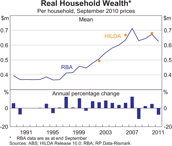
The first snapshot of household wealth from HILDA in 2002 recorded average wealth per household of almost $500,000 in September 2010 dollars, consistent with estimates compiled by the RBA from aggregate data. The HILDA Survey implies slightly stronger annual compound growth in average real wealth per household between 2002 and 2006 than the aggregate data (8 per cent versus 6 per cent). These differences reflect a number of measurement issues, including differences in the scope of the HILDA Survey.[4] For example, real estate asset growth was stronger within HILDA, although this was offset somewhat by weaker financial asset growth. Over the 2006 to 2010 period, both the HILDA measure of average real wealth per household and the aggregate measure grew by an annual compound rate of around 1 per cent.
Turning to the distributional aspects of wealth, Graph 2 shows median real wealth for all households in the left most panel. The other panels show median wealth for different wealth and income quintiles, different age groups, housing status and the states in which households reside.[5]
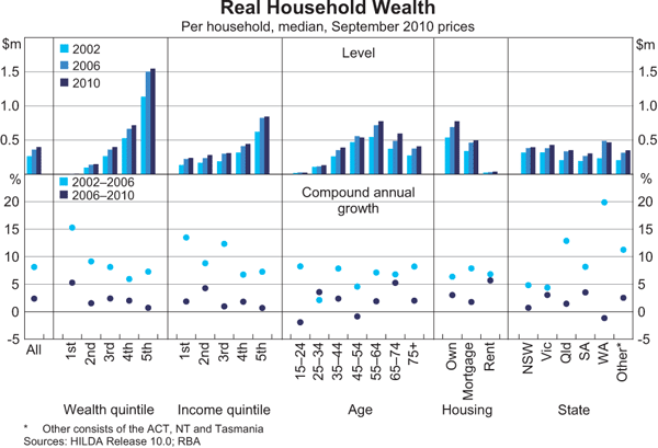
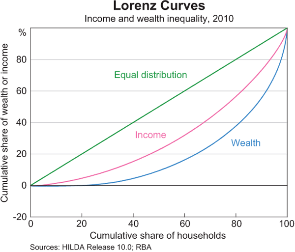
Median wealth in Australia in 2010 was a little less than $400,000, compared with mean wealth of almost $700,000. The gap between these two measures indicates that wealth is not equally distributed; a disproportionate share of wealth is held by the most wealthy households so that the distribution of wealth is positively skewed. For example, in 2010 households in the highest wealth quintile (the wealthiest one-fifth of households) held 62 per cent of total wealth. Indeed, the median wealth of this quintile was $1.5 million, around four times the median wealth of the middle quintile, at $400,000, and 10 times that of the second lowest quintile at $150,000. Part, but not all, of this skew is due to age, since older households are typically wealthier than younger households.[6] Wealth is distributed less equally than income; that is, the distribution of wealth is more skewed than that of income. This can be illustrated by the Lorenz curve, which shows the share of wealth (or income) held by households ranked by wealth (or income); the further the curve is below the 45 degree line, the less equal the distribution (Graph 3).[7]
The degree of skewness in the wealth distribution appears to have fallen over the past four years. Median wealth in the lowest wealth quintile grew at an annual rate of 5 per cent between 2006 and 2010, a larger increase than that seen by the middle three wealth quintiles (around 2 per cent), or the wealthiest quintile (a little less than 1 per cent). The same conclusion applies if we examine the longitudinal aspect of the data: tracking the same households through time, median real wealth growth was generally higher for those households that had low wealth in 2006 and lower for those households that had high wealth in 2006.[8]
The distribution of wealth across other dimensions such as household income, age and housing status generally accords with intuition: households with higher incomes generally also have higher wealth than households with lower incomes. Consistent with the standard life-cycle theory of saving, median wealth increases with age up until retirement, after which it falls. It is also clear that the median mortgage-free owner-occupier household is wealthier than the median household with a mortgage, which in turn is wealthier than the median renting household. Of course this need not be the case, as wealthy households could choose to rent and invest their wealth in non-housing assets such as shares and bonds, but in Australia this tends not to be the norm, with housing an important vehicle for household saving.
Unlike the 2002 to 2006 period, when Western Australia and Queensland experienced exceptionally strong rates of growth in real wealth, between 2006 and 2010 growth was more uniform across states and territories, with all recording growth in median real wealth of between roughly −1 to 3 per cent per annum. In part, this reflects more uniform dwelling price growth – between 2002 and 2006 real dwelling prices more than doubled in Perth and rose by almost 50 per cent in Brisbane, while they were broadly unchanged in the other state capitals. In contrast, between 2006 and 2010, real dwelling prices were broadly unchanged in Perth, while prices in Brisbane rose by the same amount as prices nationally (around 20 per cent).
In addition to changes in the valuations of assets that a household owns, wealth can change because of a net accumulation or decumulation of assets. While these flows are not recorded in HILDA, an estimate of these flows is provided by the change in each household's wealth that cannot be explained by asset price movements. While these estimates are not precise, they suggest that between the 2002–2006 and 2006–2010 periods, higher income households increased their saving relative to lower income households, that younger households increased their saving relative to older households, and that households with less wealth increased their saving relative to wealthier households. This is consistent with the analysis of Lowe (2011).
Turning to changes in the composition of household assets over the eight years to 2010, there has been a small fall in the share of riskier financial assets held (taken here as equities, trusts and superannuation) (Graph 4). This is entirely accounted for by a shift away from direct equity holdings, which fell from 6½ per cent of the average household's assets in 2002 to 4½ per cent in 2010; over the same period the proportion of households owning equities directly fell from 39 per cent to 34 per cent. Most of the fall occurred between 2006 and 2010 and was driven by both withdrawals and valuation effects. By contrast, the average shares of assets in trusts and superannuation were little changed over the period, although the share of households with superannuation holdings rose from 76 per cent to 82 per cent, indicating that the average share in superannuation for households with existing superannuation holdings declined slightly. This shift away from equities has been broad based, with all age groups reducing their exposure between 2002 and 2010. It accords with a number of other sources that suggest a reduction in the appetite for risk, and is also likely to reflect relatively low returns to equities, especially between 2006 and 2010. Conversely, real estate has increased in importance, with its share of asset holdings rising from 54 per cent to 60 per cent.
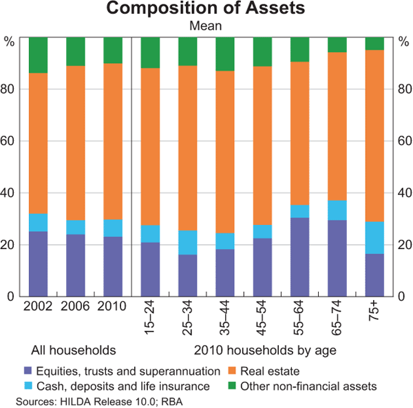
Focusing on the most recent data, it is clear that those households approaching retirement and in the early stages of retirement had the greatest exposure to movements in financial market prices. In particular, those aged 55 to 74 years held around 30 per cent of their assets in equities, trusts or superannuation, relative to around 20 per cent for most other age groups. Younger and older households tended to hold more of their assets in the form of cash and real estate, and so in aggregate would have been less exposed to falls in equity markets.
Household Financial Assets
The growth rate of household financial assets from 2006 to 2010 was much slower than it was from 2002 to 2006 (Table 1). Aggregate data suggest that this slowdown was largely due to valuation effects: valuation effects lifted financial assets by 2 per cent per annum between 2002 and 2006, but subtracted 5 per cent per annum from financial assets over the following four years, while new inflows lifted real financial assets per household by 5 to 6 per cent per annum over both the 2002–2006 and 2006–2010 periods. Growth of financial assets between 2006 and 2010 tended to be higher for groups with lower holdings of financial assets in 2006, and lower for groups with higher holdings. In part, this can be explained by the fact that wealthier households hold a greater share of their financial assets in the more risky asset classes, and so would have been more exposed to the negative valuation effects recorded between 2006 and 2010. Furthermore, new inflows, in the form of compulsory superannuation contributions, can have a proportionally larger effect on the growth rate of small financial asset holdings than on the growth rate of large financial asset holdings.
| 2002–2006 | 2006–2010 | |
|---|---|---|
| HILDA Survey – median | 7½ | 4 |
| HILDA Survey – mean | 6 | 1½ |
| Aggregate data – mean | 7½ | 1 |
|
Sources: ABS; HILDA Release 10.0; RBA; RP Data-Rismark |
||
As discussed above, the HILDA Survey suggests that wealthier households hold a higher than average proportion of their financial wealth in the form of direct equity holdings and trusts, whereas poorer households hold more in cash and superannuation (Graph 5). Investing via equities or trusts requires time and entails set-up and transactions costs, and so is likely to be less attractive to those with a relatively small amount to invest. In addition, households with less wealth may also be more cautious investors, as a loss is likely to have a greater impact on their standard of living. Wealthy households are also likely to have more disposable income and so be able to save part of their income beyond their compulsory superannuation contributions, thereby reducing the importance of superannuation assets relative to other asset holdings.
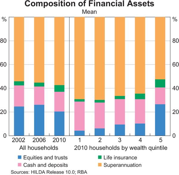
According to HILDA, superannuation constitutes a growing share of financial assets. This is especially true for older age groups. Since 2002, the HILDA Survey suggests that the average share of financial assets held in superannuation has risen by around 15 percentage points for 55 to 74 year olds, driven by younger households with more exposure to superannuation entering this age group and older households with less exposure leaving the age group. Other age groups collectively saw little change in the relative importance of their superannuation holdings.
Household Non-financial Assets
Average growth in non-financial assets moderated significantly from 2002–2006 to 2006–2010, from 10 per cent to 3 per cent per annum. The estimated median real value of households' non-financial assets was $410,000 in 2010, up from $360,000 in 2006. Non-financial assets in the HILDA Survey are comprised of holdings of real estate, business assets and durable goods such as motor vehicles and collectibles. Overall, these assets accounted for 70 per cent of households' total assets in 2010, broadly in line with the share implied by the aggregate measure (64 per cent). Given the large share of total assets accounted for by non-financial assets, the distributional aspects of the non-financial assets data are similar to those of household wealth. In particular, cross-sectional comparisons between the 2006 and 2010 HILDA Surveys suggest that the slowdown in non-financial asset growth observed at the aggregate level was broad based across income, wealth and age groups, and states.
Holdings of real estate (both primary and other residential properties) represent the largest share of non-financial assets, at around 85 per cent for households in the 2010 HILDA Survey. Hence, slower growth in property prices over 2006 to 2010 compared with the earlier period is the main reason for the slower growth of non-financial assets; business assets, vehicles and collectibles, which account for the remaining 15 per cent of non-financial assets, contracted by 4 per cent over the four years to 2010.
According to HILDA, the home-ownership rate was stable between the 2006 and 2010 survey periods, at around 67 per cent of households in both years, of which around half owned their home outright. Home ownership increases with age up until retirement, after which it falls slightly, with around 30 per cent of 15 to 24 year old household heads owning their own home, rising to a little over 80 per cent for those aged between 55 and 74, before dropping slightly for those aged 75 years and older (Graph 6). Home-ownership rates within age groups appear to have been broadly stable over the eight years to 2010. Ownership rates for other residential property, by contrast, increased from 16 per cent in 2002 to 20 per cent in 2006 and remained stable at this rate in 2010. This earlier increase in ownership was seen in all age groups, although it was most pronounced for the 25 to 54 year old group. Since 2006, the pattern has been more mixed, with ownership rates increasing for those approaching, or just past, retirement age, as well as for 25 to 34 year olds, and falling or remaining stable for most other groups.
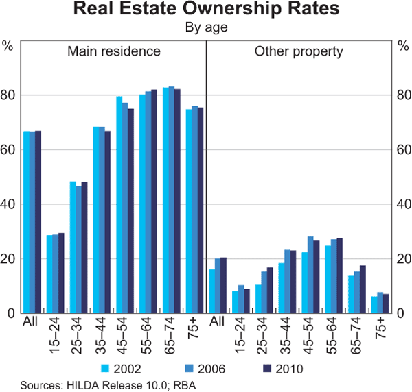
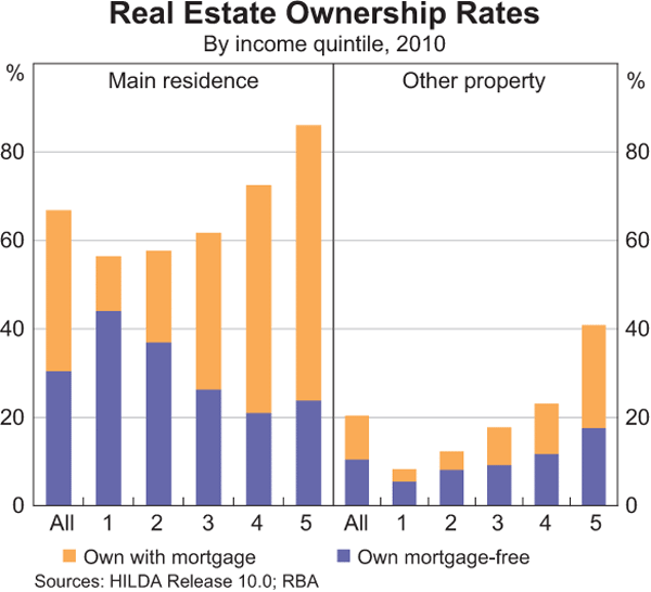
Unsurprisingly, of those households who own their own home, the proportion that do so mortgage-free tends to increase with age, from around 20 per cent for young households to over 90 per cent for older households. Home ownership, and other property ownership, also increases with income, as would be expected, although the proportion of households that own their home mortgage-free actually falls with rising income (Graph 7). This result is mainly due to the age profile of the income quintiles, with the bottom income quintile dominated by retirees who tend to own their own home outright and the top income quintile dominated by households of an intermediate age, which tend to have mortgages.
Household Debt
According to the HILDA Survey, average debt per household increased by 5 per cent per annum in real terms between 2006 and 2010, a step down from the 11 per cent per annum increase seen over the 2002 to 2006 period (aggregate data are broadly similar, suggesting increases in real per household debt of 3 and 11 per cent per annum over the two periods).
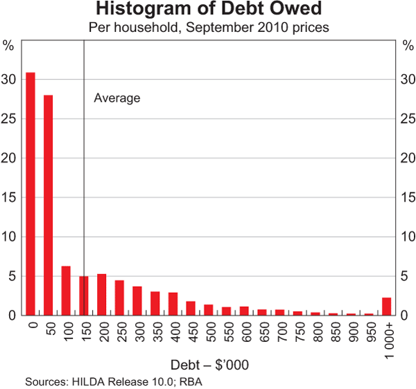
The distribution of debt is highly skewed: 31 per cent of households had no debt in 2010 (unchanged from 2006 but lower than the 35 per cent recorded in 2002) and a further 28 per cent had debts of $50,000 or less, while 2 per cent of households had debts in excess of $1,000,000 (Graph 8). Within this, property debt accounted for 80 per cent of total debt in 2010 (with main residence debt making up 57 per cent of total debt and other property debt making up 23 per cent). Business debt accounted for 6½ per cent of total debt, and the remainder was comprised of credit card, HECS and other personal debt. Tracking the same households through time, roughly one-third increased their nominal debts between 2006 and 2010, one-third reduced their debts, and one-third maintained the same level of debt, which was no debt for almost all. This is in contrast to the earlier period where more households had increased their debt (40 per cent) and less households had reduced their debt (28 per cent).
Those households with the highest incomes also have the highest levels of debt. Indeed, in 2010 the top income quintile accounted for almost half of total debt, while the top two quintiles accounted for over 70 per cent of debt. However, the distribution of debt by wealth quintile is more equal, with median debt over the top four quintiles being broadly similar at between roughly $40,000 to $60,000 (Graph 9). By age, median debt peaks for 35 to 44 year olds then falls to zero for those aged 65 years or older. This accords with intuition, with young households taking on debt to fund their education and purchase property, before paying down the debt over their working lives. Unsurprisingly, those who own their home with a mortgage are far more indebted than those who own their home outright or those who rent.
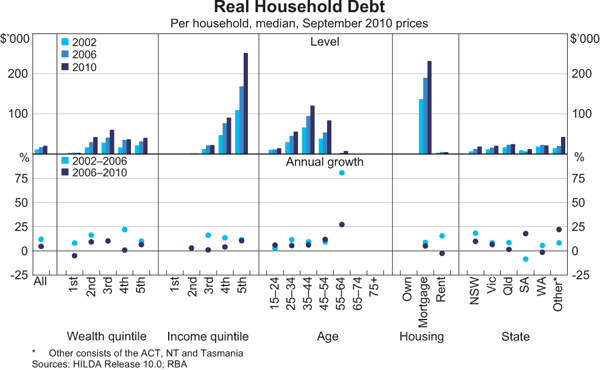
For most of the cross-sectional groups considered, debt increased at a slower pace between 2006 and 2010 than over the previous four-year period. In line with their high share of debt outstanding, high-income households contributed most to the slowdown – debt growth in the top income quintile slowed from 12½ per cent per annum to 5½ per cent, accounting for around half of the 6 percentage point slowdown in the rate of total debt accumulation. For the sample as a whole, the slowing in debt accumulation tied to main residences and tied to other property each accounted for around 40 per cent of the overall slowdown in debt accumulation, although other property debt slowed much more sharply.[9] The slowdown in the growth of other property debt appears to have been most pronounced among low-income earners, households from Queensland, and households with household heads aged less than 25 years or greater than 64 years.
The ratios of debt to income and debt to assets (gearing) provide an indication of the ability of households to service their debts. The HILDA data suggest that the median debt-to-income ratio for households with debt was 150 per cent in 2010, up from 130 per cent in 2006 and 110 per cent in 2002 (Graph 10).[10] High-income households generally have higher debt-to-income ratios than lower-income households; median debt-to-income ratios increase from 60 per cent for those households in the second income quintile to over 200 per cent for the highest earners. This reflects the fact that high-income earners can devote a larger share of their income to servicing their debts while still maintaining a given standard of living, and so can sustain a larger debt burden. Similarly, middle-aged households are likely to be in the prime of their working lives and so be able to sustain larger debt burdens than the young or old.
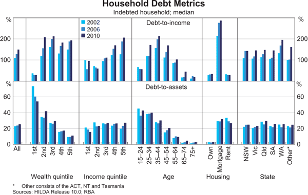
The median gearing ratio of those with debt has also been rising – from 23 per cent in 2002 to 24 per cent in 2006 and 25½ per cent in 2010. The gearing ratio falls as wealth increases, suggesting that less wealthy households who owe debt are more highly geared than richer households who owe debt. This is due to relatively low asset holdings of less wealthy households, rather than high debt levels. Gearing also falls with age, as would be expected.
Conclusion
While aggregate data can give an indication of average household wealth in Australia, household level data are needed to examine the distributional aspects of wealth. The HILDA Survey provides one such source of data. It confirms that wealth is unevenly distributed, but to a lesser extent in 2010 than it was in 2006 (over the four years to 2010, wealth grew faster for households with lower wealth than for households with higher wealth). The distribution of debt is also highly skewed: the top 20 per cent of income earners owe almost half of all debt outstanding, while one-third of households owe no debt and over half owe less than $50,000.
Footnotes
The author is from Economic Analysis Department; he would like to thank Luis Uzeda for help with some of the analysis contained in this article. [*]
This article updates previous work done by the Bank. See Kohler, Connolly and Smith (2004) and Bloxham and Betts (2009). All graphs in this article show cross-sectional data. Growth rates presented in graphs compare cross-sections from each period. [1]
See B22 Distribution of Household Balance Sheets, B23 Distribution of Household Gearing, B24 Distribution of Household Financial Assets, B25 Distribution of Household Non-Financial Assets and B26 Distribution of Household Debt, available at <http://www.rba.gov.au/statistics/tables/>. Data are weighted to be representative of the population as a whole. To enable comparison across time, an adjustment is also made for the change in purchasing power between periods by converting the values in earlier surveys to September 2010 dollars using the consumer price index. [2]
Households can drop out of the HILDA Survey due to death, a move overseas, loss of contact with the survey, or a refusal to remain in the survey; the newly formed households created by the split of an existing household remain in the survey. For more information on the HILDA Survey, see <http://www.melbourneinstitute.com/hilda>. [3]
Dwelling prices in HILDA are based on households' judgements about the value of their property, while the RBA data use recorded sales prices. Similarly, debt and financial assets within HILDA are based on household responses, while the RBA data are based on information obtained from financial institutions. The RBA data also include not-for-profit institutions serving households in the household sector, while HILDA does not. [4]
Each quintile represents 20 per cent of households, so that the first wealth quintile represents the poorest 20 per cent of households, while the fifth wealth quintile represents the richest 20 per cent of households. [5]
For example, looking within age groups, the ratio of the wealth of the richest 20 per cent to the second lowest 20 per cent is around 7 times, compared with 10 times for the sample as a whole. [6]
For example, the value on the y axis of the Lorenz curve for wealth at 80 on the x axis gives the proportion of total wealth held by households in the bottom four wealth quintiles, in this case around 40 per cent. [7]
This result is potentially influenced by measurement error: if a high wealth household is incorrectly recorded as having low wealth in 2006 but this error is corrected in 2010, it will incorrectly appear as if a poor household has experienced strong growth in wealth. Similarly if a low wealth household is incorrectly recorded as having high wealth in 2006 but this error is corrected in 2010, it will incorrectly appear as if a rich household has experienced weak growth in wealth. However, the use of medians, which are robust to outliers, should serve to alleviate this problem. [8]
The stock of debt tied to main residences is larger than the stock of debt tied to second homes and investment properties, so a larger slowdown in other property debt is needed to cause the same contribution to slowing in total debt. [9]
Aggregate data suggests that the average debt-to-income ratio (including those households with no debt) was 154 per cent in 2010; the comparable ratio from HILDA was much higher at 214 per cent, although if we adjust the HILDA data to take account of a number of differences with the aggregate data, the nationwide HILDA debt-to-income ratio falls to around 150 per cent. The discrepancy is due to a number of conceptual and technical differences between aggregate income as measured by the ABS and income as reported within HILDA. In particular, income in HILDA is predominantly defined as cash received in the reporting period that is regular and recurring, whereas aggregate income as defined by the ABS includes non-cash income (such as imputed rent) as well as income accrued during the period but not received (for example, employer contributions to superannuation on behalf of employees). [10]
References
Bloxham P and T Betts (2009), ‘The Composition and Distribution of Household Wealth in Australia’, RBA Bulletin, April, pp 5–23.
Kohler M, E Connolly and K Smith (2004), ‘The Composition and Distribution of Household Assets and Liabilities: Evidence from the 2002 HILDA Survey’, RBA Bulletin, April, pp 1–11.
Lowe P (2011), ‘Changing Patterns in Household Saving and Spending’, Address to the Australian Economic Forum 2011, Sydney, 22 September. Available at <http://www.rba.gov.au/speeches/2011/sp-ag-220911.html>.