Speech Changing Patterns in Household Saving and Spending
Good morning. I am very pleased to be able to be part of this year's Australian Economic Forum.
Two weeks ago, the Governor of the Reserve Bank of Australia (RBA), Glenn Stevens, gave a speech in Perth titled ‘Still Interesting Times’. One consequence of living in these interesting times is that there is no shortage of interesting things to talk about. There is the inexorable shift of global economic weight to Asia, the public-debt problems in the North Atlantic economies, the multi-speed nature of the Australian economy, the more conservative approach to spending and borrowing by Australian households, and the list goes on.
You will be relieved to hear that I don't plan to talk about all these today. Rather, I would like to spend my time this morning exploring just one of these issues, and that is the changing patterns in household saving and spending in Australia. This issue is not only interesting in its own right, but understanding these changes also helps us understand some of the broader changes that are occurring within the Australian economy.
Household Savings
At the aggregate level, the story on household saving is, by now, well known.
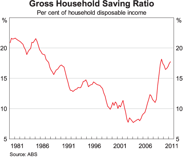
From the mid 1980s to the mid 2000s, the aggregate household saving ratio declined significantly (Graph 1). Then, over the past half dozen years, this decline has been reversed, and the aggregate household saving ratio is now back to where it was in the mid 1980s. Glenn Stevens has recently spoken at length about why these changes took place.[1] In particular, he drew attention to the fact that as nominal interest rates declined and the availability of credit increased, household spending grew more quickly than income for around a decade or so. Although this adjustment was drawn out, it was, by nature, a one-off event. So even before the North Atlantic financial crisis, households were returning to more traditional norms of saving and borrowing, and, no doubt, the crisis accelerated this return.
This aggregate story is interesting, but it can only take us so far in understanding what has been going on. At the RBA, we spend considerable effort delving underneath these aggregate figures, so as to better understand the factors affecting individuals' decisions about saving and spending. One way that we do this is to use the HILDA (Household, Income and Labour Dynamics in Australia) survey which, each year, tracks the finances of individual households. Although the survey does not ask households how much they saved each year, saving ratios can be estimated from 2006 onwards using the income and spending numbers reported in the survey.[2] Having done this, we can compare how the distribution of saving ratios across the population changed between 2006 and 2009, the latest year for which data are available. This period is especially interesting because of the large increase in the aggregate saving ratio that occurred, with 2009 marking a peak in the aggregate ratio.
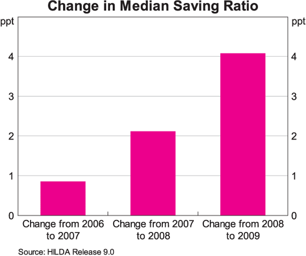
Perhaps the easiest way to summarise the results is to show how the median of the distribution has changed over time (Graph 2). Between 2006 and 2007, the median saving ratio increased by 1 percentage point. It increased by a further 2 percentage points in 2008 and then jumped by 4 percentage points in 2009, for a cumulative increase of 7 percentage points over these three years.[3] This figure turns out to be quite close to the 8 percentage points increase in the aggregate saving ratio over this period calculated from the national accounts. The micro level data suggest that the increase in saving ratios was quite widespread across the population. It also confirms that an increase in saving ratios was occurring prior to the financial crisis, but that the crisis saw a marked acceleration of this trend.
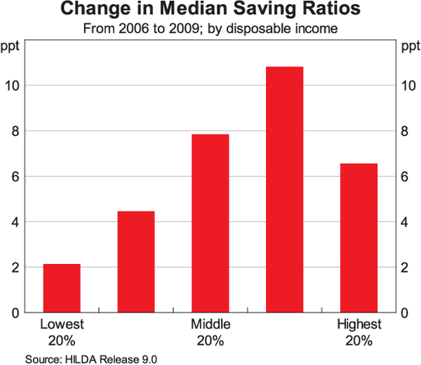
When we drill down into the data in more detail, an increase in saving ratios is apparent across the entire income distribution, although not surprisingly, the increase is smallest for households with the lowest incomes (Graph 3).[4] Many of these low-income households spend a significant share of their income on the basic necessities and they have limited scope to increase the share of their income that they save.
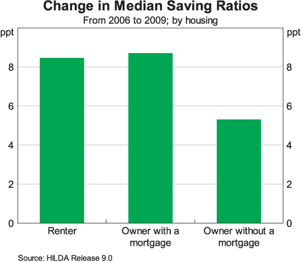
Another way of looking at the data is by housing tenure. Graph 4 shows that the saving ratio has increased for those that rent, for those with a mortgage and for those that own their dwelling outright. This again confirms that the increase in saving has been quite widespread, although, the increase in saving has been smallest for those households that own their dwelling outright.
It is also possible to look at how saving rates have changed for different age groups (Graph 5). Doing this, it is clear that the increase has been largest for younger households and smallest for older households. This result holds for both households that are renting and those that are owner occupiers. The survey suggests that younger households have experienced income growth broadly in line with that of other groups. However, their spending has not grown as quickly as these other groups, hence the relatively large increase in their saving.
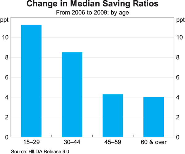
Taken together, this evidence is consistent with the idea that higher housing prices and debt levels have contributed to a reassessment of saving decisions, although, obviously, the reasons for the increase in saving go well beyond what has happened in the housing market. Higher housing prices have required higher deposits and this requires more savings. This trend has probably been reinforced by developments on the lending side, with most lenders lowering their maximum loan-to-valuation ratio over recent years. Saving decisions today are also likely being influenced by the earlier rise in debt levels relative to incomes and by debt servicing burdens that are staying higher for longer. The adjustments seem to have been particularly pronounced among younger households who are hoping to enter the housing market or who have recently entered the market.
There are two other aspects of the individual level data that I would like to draw your attention to.
The first of these is the relationship between the change in saving and a household's holdings of financial assets (excluding deposits).[5] To explore this relationship, we have divided households in each income quintile into two groups – those with above-average holdings of financial assets and those with below-average holdings – and then calculated the median change in the saving ratio for each group between 2008 and 2009, the year of the financial crisis. The results of this exercise are shown in Graph 6, with the top line showing the median increase in the saving ratio for households with high financial assets and the bottom line showing the change for those with low financial assets. It is clear that for all five income quintiles, households that had relatively high levels of financial assets before the financial turmoil increased their saving by more than households with relatively low levels of financial assets.
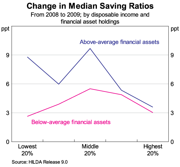
This evidence is consistent with the idea that the fall in financial asset prices over recent years led households to increase their saving out of current income in order to rebuild their asset positions. When share prices fell, household wealth declined and, as a consequence, increased saving was required to attain any desired level of wealth. This was particularly the case for those households that held a lot of financial assets. This experience is the flipside of what happened during the decade to the mid 2000s. During that period, household wealth increased substantially by way of increasing asset prices, despite households saving relatively little out of their current income.
The second aspect of the individual-level data that I would like to draw your attention to is the relationship between the change in the saving ratio and how much uncertainty a household feels about the future. This is a difficult issue to investigate, but it is an important one as the financial crisis of 2008/09 all too clearly illustrated. During that period, uncertainty around the world increased greatly, with the result that both households and businesses delayed discretionary spending and increased their savings, amplifying the downturn in the global economy.
In the HILDA survey, households that are in employment are asked each year how worried they are about the future of their job.[6] Using the responses to this question, we classify households into four groups: those that have become less worried over time; those that have become a little more worried over time; those that have become a lot more worried; and those where there has been no change. As before, we calculate the change in the median saving ratio for each of these groups and the results are shown in Graph 7. It is clear from this graph that the largest increase in saving ratios is for those households that have become a lot more concerned over time about losing their job. And conversely, the smallest increases in saving have been for those who have become less concerned about losing their job.
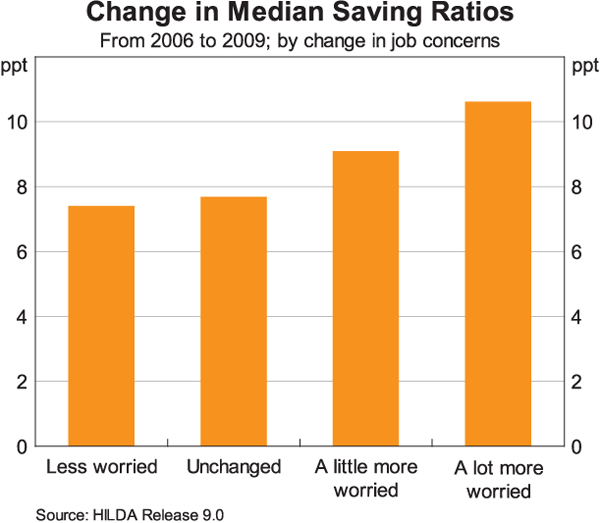
Here, the evidence is consistent with the idea that when people become more uncertain they save more to build up larger buffers against the possibility that something goes wrong later on. It is also consistent with earlier work at the Reserve Bank showing that households that are particularly uncertain about the future tend to spend less of any increase in income than do households that are more confident.[7]
In summary, this work on savings using household level data confirms many of the popular explanations for the recent increase in savings. Higher housing prices and debt levels have had an effect, as have falls in the prices of investment portfolios and a general increase in uncertainty. This work also confirms that the increase in saving has been widespread across the population.
Household Spending
I would now like to turn from saving to spending and look at the changes that have been taking place in household expenditure patterns. The two most comprehensive sources of data in this area are the quarterly national accounts and the Household Expenditure Survey, which is currently conducted every six years by the ABS. The latest survey took place in 2009/10 and was released just a couple of weeks ago. It covered almost 10,000 households and classifies expenditure into over 600 individual categories, ranging from ‘towels and face washers’ to ‘road tolls’ to ‘ten pin bowling charges’.
Looking at the longer-term trends from both these sources, two changes stand out.
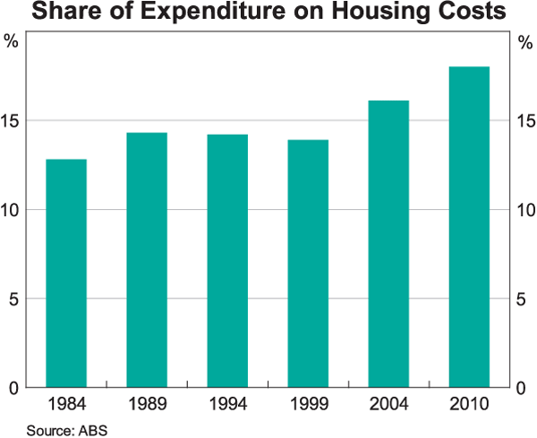
The first is the significant rise over time in the share of total expenditure on housing. When the Household Expenditure Survey was conducted in the early 1980s, housing accounted for a little less than 13 per cent of total expenditure (Graph 8). By way of contrast, in the recent survey this share had increased to 18 per cent. This is the largest change in any single expenditure category. The bulk of this change took place over the past decade and largely reflects the rise in interest payments on mortgage debt due to higher levels of debt relative to income.
The second longer-term change is a decline in the share of spending on goods and an increase in the share of spending on (non-housing) services. For example, in the early 1980s, spending on clothing, footwear, household equipment and furniture totalled around 14 per cent of total household expenditure. Today, the figure is just over 8 per cent. In contrast, there have been substantial rises in the shares of total expenditure accounted for by health, education and a range of household and personal services. While these increases are partly explained by a rise in the relative prices of many of these services, the volume of consumption of these services has also increased.
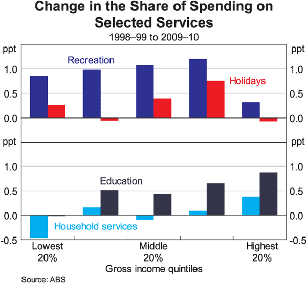
These broad trends can be seen across the entire income distribution, although there are some subtle differences across incomes. The decline in the share of spending on clothing and footwear, for example, is evident across all income groups. Conversely, households in all income quintiles are spending a higher share on services, with the largest increases evident in expenditure on recreation services, such as pay TV and the internet (Graph 9). In addition, for many middle and lower income households there has been a noticeable increase in the share of spending on holidays. It would appear that rising incomes, the appreciation of the exchange rate and the emergence of low-cost airlines have made travel more affordable for many people. There has also been a general increase in the share of expenditure devoted to education and, for higher-income households, a noticeable increase in spending on household and personal services. Looking forward, it is likely that these broad trends will continue.
Returning to the aggregate data, the different trends in spending on goods and services are also evident in the national accounts which measure changes in expenditure adjusted for movements in relative prices. The differences have been unusually pronounced over the past year, with consumption of goods increasing by around 1¾ per cent, compared with growth of around 4 per cent in the consumption of services (Graph 10).
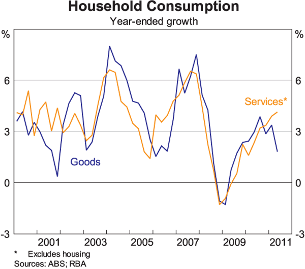
The recent relatively weak growth in the consumption of goods has led to very subdued trading conditions in many parts of the retail sector. In contrast, conditions have been better in a number of the service parts of the economy. Again, according to the national accounts, consumption of education services is up by 5 per cent over the year, recreation and culture is up by 7 per cent, hotels cafés and restaurants is up by over 6 per cent, and consumption of transportation services is up by well over ten per cent.
These outcomes suggest that although households are saving a higher share of their income than in the past couple of decades, they have also been prepared to increase their spending on services quite significantly.
Exactly why this is so is difficult to pin down. One can't completely rule out the possibility that spending on some goods is being understated due to increased internet purchases from foreign retailers, although this is unlikely to be a particularly large part of the story. Another explanation is that there has been a gradual shift in household preferences away from goods and towards ‘experiences’. This would be consistent with the strong growth in spending on recreational activities that has occurred over recent times. A more important factor though is likely to have been the strong growth in household income. Over the past year, aggregate household disposable income is up by around 7½ per cent, and this has boosted spending on those services that are quite sensitive to income growth.
This increasing importance of consumption of services in Australia poses a challenge in tracking overall growth in consumption in real time. The main high-frequency data that we have is on the consumption of goods. Australia has long had a comprehensive retail trade survey that is published on a monthly basis by the ABS, with this survey reporting separate results for various types of retail establishments. But the spending measured in this survey currently accounts for only about one third of total consumption, and this is down from around 40 per cent in the early 1980s.
Unfortunately, for most services there are few timely and comprehensive measures of spending. There are, however, a number of high-frequency indicators that the Bank tracks that provide some insight into this part of the economy. To take just one example, there are a variety of monthly indicators of spending on transportation including: the number of litres of petrol sold; the number of domestic flights; the number of international flights; and the number of passengers on certain public transport networks (Graph 11). Over recent times, the data on international flights, in particular, have provided some timely insight into the relative strength of services consumption, with Australians travelling overseas in ever increasing numbers.
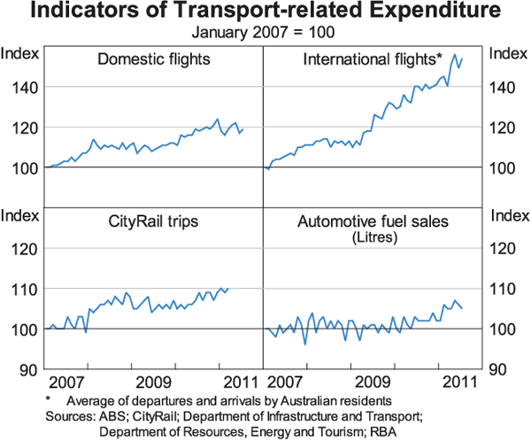
However, while these various partial indicators are useful, they fall well short of being a full substitute for comprehensive and timely measures of services consumption. The ABS forward work program includes efforts to improve the measurement of services consumption and the Bank strongly supports these efforts.
Conclusion
So in conclusion, there are significant changes in saving and spending patterns taking place in Australia. The effects of these changes are probably most pronounced in the retail sector, with both increased saving and the switch towards services lessening growth in spending on goods. As a result, conditions are quite difficult for many retailers.
The increased household saving is, however, a positive development from a national risk-management perspective. Households are using some of their income growth to build up bigger financial buffers, and this should hold them in good stead in the uncertain world in which we live. These higher saving rates are likely to be quite persistent and they represent a return to more traditional patterns. While they partly reflect the ongoing adjustment to the earlier big run up in housing debt and housing prices, the evidence that I have talked about today suggests that there are also other factors at play. In particular, many households appear to have increased their saving in response to the decline in equity prices and an increase in uncertainty about the future. It is reasonable to expect that, at some point, the impact of these factors will begin to wane, although exactly when remains an open question.
The Reserve Bank continues to monitor these trends very carefully, both at the national level and the micro level. Over the period ahead, the way in which households respond to the global uncertainties and the continuing growth in their incomes will, no doubt, have an important bearing on developments in the Australian economy.
Thank you.
Endnotes
I would like to thank Jarkko Jaaskela, Luis Uzeda and Callan Windsor for extensive assistance in the preparation of this talk. [*]
See Stevens G (2011), ‘The Cautious Consumer’, Address to the Anika Foundation Luncheon, Sydney 26 July. [1]
Similar changes are evident across the entire distribution of saving ratios. [2]
The actual levels of the saving ratios calculated from the HILDA data are substantially higher than those from the national accounts, as the HILDA survey does not capture all components of household expenditure. This difference should, however, have relatively little effect on estimates of the change in the saving ratio over time. [3]
For the purposes of classifying households into income bands, income is measured as average household disposable over the period from 2005/06 to 2008/09 in an effort to capture income in ‘normal’ times. It is also ‘age matched’ to avoid the effect of life-cycle factors and an adjustment is made for the number of people in the household. [4]
Financial assets include superannuation, cash investments (i.e. bonds), equity investments, trust funds and life insurance. [5]
Respondents are asked to rank their feeling about the statement ‘I worry about the future of my job’ on a scale of one to seven (strongly disagree to strongly agree). Households were classified as: ‘less worried’ if their perceived job insecurity response decreased between 2006 and 2009; ‘slightly more worried’ if their response increased by one step; and ‘a lot more worried’ if their response increased two or more steps. [6]
See Berger-Thomson L, Chung E and R McKibbin (2009), ‘Estimating Marginal Propensities to Consume in Australia Using Micro Data’, RBA Research Discussion Paper No. 2009-07 [7]
