RDP 2023-01: The Effect of Credit Constraints on Housing Prices: (Further) Evidence from a Survey Experiment 9. Empirical Model: Simulating Demand Curves from Household Characteristics
January 2023
- Download the Paper 1.55MB
Empirical modelling reveals that some of the heterogeneity in households' WTP responses can be predicted based on observable household characteristics like income, wealth, age and housing tenure status. Further, this predictable component of heterogeneity is sufficient to drive the differences between average changes in WTPs and the change in the marginal buyer's WTP observed in direct analysis of the demand curves. This finding complements the theoretical user cost approach by showing that the pattern of heterogeneous behaviour in the survey can be quantitatively explained by observable household characteristics.
The empirical models can also be used with observational datasets that do not include stated preference questions for out-of-sample inference about the effect of financing conditions. I show that the estimated effects are similar using US data from the Survey of Consumer Finances, and then simulate the effects of financing conditions in other times and countries.
The relationship between a household's discount rate and their WTPs in different financing conditions is nonlinear (see Figure 8). In principle, mapping the empirical model through the user cost framework could improve upon a simple linear model of WTP as a function of household characteristics. However, the nonlinearity is only important for very steep discounters, and the predictions models do not capture that part of the distribution well (see Appendix C.1 for details). As a result, I focus on the simple OLS models because they work at least as well as the user cost model when taken to the data, the marginal effects are easier to interpret, and they do not require normalisation.
9.1 Leave-one-out prediction method
Simulating demand curves requires predictions of the normalised WTPs in both down payment conditions, generated from observable financial and demographic variables. Fuster and Zafar (2021) estimate regression models with a large set of observational variables that do just that. My focus is on prediction, including out-of-sample prediction, so I guard against overfitting in two ways. First, as well as replicating the estimations in Fuster and Zafar, I also estimate much smaller models. Second, I use leave-one-out predictions to assess the models and construct demand curves. For each household I estimate the parameters using all other households and then use the estimated parameters to construct a prediction for the household in question. Those predictions are used to calculate an R2 and construct the simulated demand curves.
I estimate linear regression models using Equations (3)–(7). Three different versions of the model use different explanatory variables, denoted X. The first is the full set of variables used in Fuster and Zafar (2021).[10] The second set is smaller and only includes variables that are important to behaviour and likely to be relevant in other time periods and places: tenure status (rent/own); age of the household head; as well as income and available equity, both expressed relative to the household's home value. The third set of explanatory variables is the same as the second but without tenure. Tenure drives a lot the variation in WTPs, but is quite correlated with other important variables like available equity. Removing it is helpful for investigating how the models work in other countries with different institutional arrangements.
where the and coefficient vectors for each household are estimated in regressions
To construct the demand curves I take the fitted values of the WTPs with two different collateral constraints from each of the leave-one-out regressions. I then order the WTPs using the same method as in the first part of the paper.
9.2 Results
The large model with the full set of explanatory variables has the best in-sample fit, but the fit worsens substantially using leave-one-out predictions (Table 3). Conversely, the small models have a similar fit in sample and using leave-one-out predictions, suggesting they are not overfitted and are more suited to out-of-sample predictions.
| X data used for predictions(a) | Full | Small | No tenure |
|---|---|---|---|
| Number of parameters | 50 | 5 | 4 |
| 0.21 | 0.16 | 0.11 | |
| 0.10 | 0.14 | 0.10 | |
| 0.26 | 0.22 | 0.16 | |
| 0.16 | 0.21 | 0.15 | |
| Mean (WTP) minus change in marginal WTP (0.11 in data) | 0.12 | 0.10 | 0.11 |
|
Notes: Outliers are removed by trimming 4 per cent from the dependent variables, in order to match the sample size of the 5 per cent trim of the change in WTP. |
|||
The simulated WTPs can be used to construct demand curves and model the change in the WTP of the marginal buyer. The mean change in simulated WTPs is the same as in the data by construction, but the method does not guarantee that the change in the marginal buyer's WTP matches the estimates directly from the WTP data. The bottom row of Table 3 shows that all the models are able to match the direct empirical estimate of the difference between the average WTP change and the marginal buyer WTP change. The systematic heterogeneity captured by the observable data is sufficient to drive the main results of demand curve analysis.
The two models with smaller sets of explanatory variables are the most promising models for out-of-sample simulation. Table 4 shows the parameter estimates for these two models for WTPs with a 20 per cent down payment, a 5 per cent down payment, and the change in WTP. Owning your own home is an important variable driving the effects of the collateral constraint. It raises the WTP in either down payment condition, but by much less in the looser per cent down payment condition. Similarly, available equity (relative to a household's home value) has a smaller positive effect on WTP in the looser condition. Owning a home is highly correlated with available equity, which means the coefficient on available equity is larger when tenure status is omitted. Available equity is inverse hyperbolic sine transformed to allow for households with zero and negative equity, while approximating a log-log specification for higher levels of equity.[11] To get a sense of the magnitude of the coefficient, the 0.10 for WTP20 means that a rise in a household's available equity from zero to 10 per cent of the home value leads to a doubling of its WTP, while a rise in available equity from 10 per cent to 20 per cent of the home value increases the household's WTP by 7 per cent. The income variable is inverse hyperbolic sine transformed in the same way. Income has the same positive effect on WTPs in both down payment conditions, so has no effect on the responsiveness to collateral constraints.
| WTP20% | WTP20% | WTP5% | WTP5% | (WTP) | (WTP) | |
|---|---|---|---|---|---|---|
| Owns home | 0.40*** (0.05) |
0.20*** (0.03) |
–0.20*** (0.03) |
|||
| Available equity(a) | 0.06*** (0.01) |
0.10*** (0.01) |
0.03*** (0.01) |
0.05*** (0.01) |
–0.03*** (0.01) |
–0.05*** (0.01) |
| Income(a) | 0.10*** (0.02) |
0.10*** (0.02) |
0.10*** (0.01) |
0.11*** (0.01) |
0.01 (0.01) |
0.00 (0.01) |
| Age(b) | –0.01 (0.01) |
0.01 (0.02) |
–0.03*** (0.01) |
–0.02 (0.01) |
–0.02** (0.01) |
–0.03*** (0.01) |
| Constant | –1.24*** (0.12) |
–1.18*** (0.12) |
–0.74*** (0.08) |
–0.71*** (0.08) |
0.50*** (0.08) |
0.47*** (0.08) |
| Observations | 816 | 816 | 816 | 816 | 816 | 816 |
| Adjusted R2 | 0.22 | 0.15 | 0.16 | 0.13 | 0.16 | 0.11 |
| RMSE | 0.51 | 0.53 | 0.35 | 0.36 | 0.32 | 0.33 |
|
Notes: ***, ** and * denote statistical significance at the 1, 5 and 10 per cent levels, respectively. Standard errors are in parentheses. (a) Available equity and income are relative to home value. |
||||||
Figure 10 shows the simulated demand curves for the smaller model including tenure status. As in the raw data, the shifts in demand are larger at the lower end of the demand curve. Overall the predicted demand curves are flattened compared to the raw data because idiosyncratic variation is driving the tails. The left panels show the simulation of conditional expected value for each WTP. The models only explain a fraction of the variation in the experimental data, which means the fitted values have less variation than the actual data. To better capture the variability of the actual data, the right panels of Figure 10 add stochastic idiosyncratic error terms for each household based on the estimated models. The error covariance is estimated using a seemingly unrelated regression system to capture the correlation of errors within an individual's response. The stochastic simulation better captures the spread of the data but misses the nonlinearity of WTP changes at the lower end of the demand curve.
The predicted demand curves contain only the systematic variation in responses. Any idiosyncratic variation among respondents, and any noise or errors from the survey, should be stripped out through the OLS estimation. In reality, both idiosyncratic and systematic heterogeneity among households will affect market pricing, but there is no way to reliably distinguish idiosyncratic heterogeneity from survey noise and errors.[12]
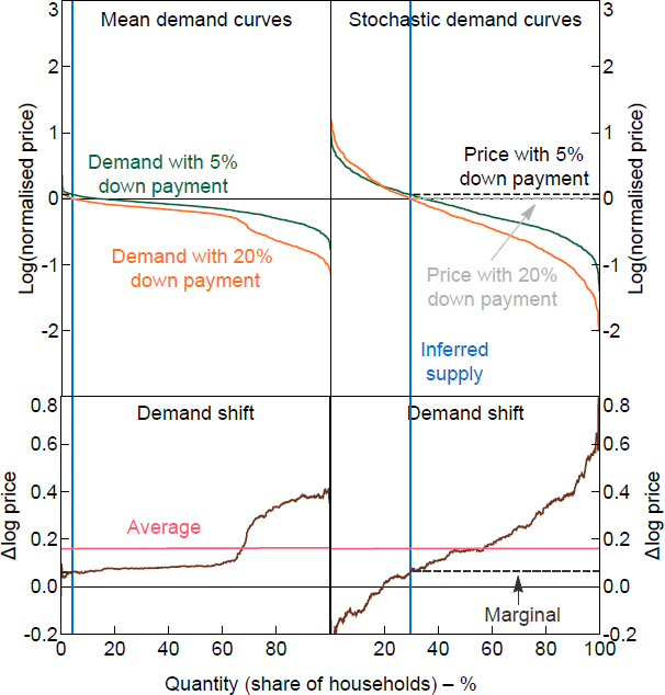
Notes: Mean curves show the fitted values for WTPs; stochastic curves add a random error generated using the error covariance matrix. The normalised price is relative to the home value.
9.3 Validating the model on contemporaneous US data
The estimated models above can be used to simulate stated WTP responses for any standard household data set that includes age, income, wealth, tenure status and home values.[13] As a validation exercise, I use the estimated models to simulate responses based on the US Survey of Consumer Finances (SCF) in 2013, which is an independent data source from the around same time as the survey used for the experiment. Figure 11 shows the simulated demand curves using the equivalent household characteristics taken from the 2013 SCF. The demand curves show a similar pattern to the demand curves from the SCE in Figure 10. As a result, the simulated average change in WTP and change in the marginal buyer's WTP are also similar across the two data sources, with the SCF simulations within 1 percentage point of the SCE results. The stochastic demand curves shown in the figures are one example of a stochastic draw of the demand curves simulated using the estimated error covariance matrix of the regressions. The mean demand curves are constructed from the conditional expected WTPs from the regression models.
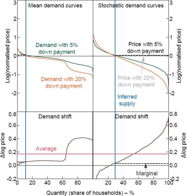
Notes: Mean curves show the fitted values for WTPs; stochastic curves add a random error generated using the error covariance matrix. The normalised price is relative to the home value.
Sources: Author's calculations; Board of Governors of the Federal Reserve System
9.4 Simulating the model with Australian data
In this section I take the estimated model and simulate the effects of a 15 percentage point loosening of collateral constraints using Australian data from the Survey of Income and Housing (SIH) between 2003/04 and 2019/20.[14] The US and Australian housing markets have some commonalities, like a owner-occupier rate of around two-thirds. The distribution of income, wealth and housing prices is different in the two countries, and that is what the simulation can take into account. Other differences in the housing market, and the mortgage market in particular, are not captured in the simulations. Two important differences are the tax deductibilty of mortgage interest in the United States, and the high prevalence of 30-year fixed, but refinanceable, mortgage rates in the United States compared to the use of variable rates and shorter-term fixed rates in Australia.
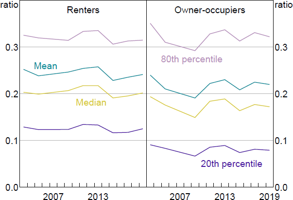
Home ownership is an important input to the model, and the rate of home ownership in the SIH fell from 72 per cent in 2003/04 to 69 per cent in 2019/20. There are notable differences between renters and owner-occupiers in home value, and even more so in available equity relative to a household's home value (Figures 12 and 13). Income relative to home value is much more similar across tenure status (Figure 14). Home value rises over time for renters and owners, while the distribution of income and available equity relative to home values are fairly stable over time.
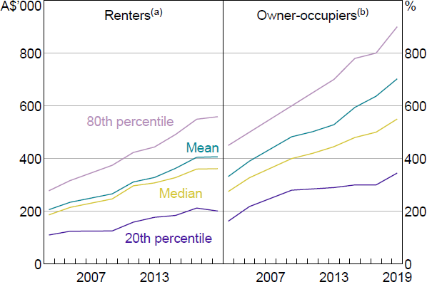
Notes:
(a) Imputed from reported rent and capital city rental yields.
(b) Self-reported.
Sources: ABS; Author's calculations
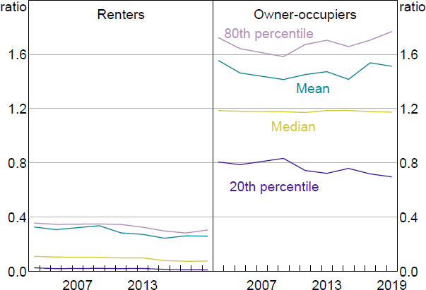
Note: Equity available is net wealth less superannuation, cars and trusts, divided by home value.
Sources: ABS; Author's calculations
Sources: ABS; Author's calculations
The simulated responses of Australian households to an easing of down payment constraints based on the SIH input data are summarised in Figure 15.[15] All years show the same pattern as the actual US experimental data: the average WTP change is much greater than the change in the marginal WTP. Using the model including tenure status, the simulated average change in the Australian data is similar to the US experimental data at around a 15 per cent increase. Omitting tenure status attenuates the simulated effect in the Australian data but not the US. Omitting tenure status increases the simulated effects of observed wealth relative to home price, so the difference with the US results suggests Australian renters appear to be less constrained than US renters. The simulated change in marginal WTP is lower in the Australian simulations than the US data or simulations.
The simulation results for Australia are reasonably stable over time. Housing prices rose substantially between 2003 and 2019 but, as documented in La Cava and Wang (2021), household liquidity nevertheless increased. The simulated effects also take into account other forms of wealth, like home equity.
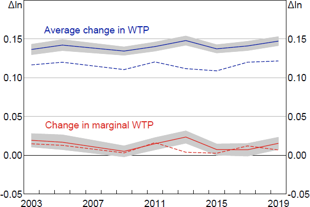
Notes: Solid line includes tenure status in the model; dashed line excludes. Shading denotes bootstrapped confidence intervals that show sampling variability from the Australian SIH data only.
To investigate the model simulations using different housing markets with different tenure arrangements, I apply it to Spain and Switzerland. These two countries have the highest and lowest home ownership rate in the OECD, respectively. In line with those home ownership rates, Spain shows a smaller effect of credit constraints than the United States and Australia, while Switzerland shows a larger effect. However, when tenure is omitted from the model, the differences in Spain and Switzerland are attenuated. Cultural and institutional differences related to the rent versus buy decision in those countries mean housing tenure is less correlated with financial constraints compared to the United States and Australia.
Footnotes
Details of these full regressions are in Appendix C.2. [10]
Using the inverse hyperbolic sine transformation means the coefficient and marginal effect estimates depend on the scale of the variable, with it closely approximating a log transformation above 10 (see Bellemare and Wichman (2020)). I include the available equity as a percentage, that is . Including it as a fraction makes it close to linear because the magnitudes are frequently close to zero and often less than 1. It also degrades the fit of the model. [11]
Take, for example, the bottom end of the demand curves in Michigan (see Figure 1) and Illinois. Both show large responses to the down payment change, but the 20 per cent WTP in Illinois looks a bit like the respondent accidentally wrote US$10,000 instead of US$100,000 given they have US$5,000 in home equity and US$7,500 in liquid savings. Whereas the low response in the Michigan demand curve is more consistent with their zero liquid savings. But this is guess work. [12]
It is rare for surveys to include an estimate of the home value of renters, so I use actual rent paid together with data on rental yields. [13]
The SIH is a biennial household survey that collects information on income, wealth, housing and various other household and personal characteristics. I omit the 2007/08 SIH as some of the wealth variables were not collected. [14]
The simulated demand curves for each year look very similar to the simulation for US data in Figures 10 and 11. [15]