Research Discussion Paper – RDP 2019-04 A History of Australian Equities
June 2019
1. Introduction
The equity market is one of Australia's largest and most high-profile financial markets. The total capitalisation of listed companies in Australia is nearly $2 trillion, and around $5 billion in shares are traded every day. Most large well-known companies in Australia, such as the major banks and resources companies, are listed; these account for a large part of Australian output and employ a significant number of people. And households are quite exposed to movements in share prices; if not directly, then through their superannuation, which is typically heavily invested in Australian equities.
Historical facts about the Australian equity market, however, can be difficult to identify with confidence, because coverage of Australian equities is quite mixed. This patchy coverage can, perhaps, be attributable to the relatively fragmented nature of the national stock exchanges until the 1980s. This paucity of data is in contrast to equity markets overseas. For example, Shiller (2000) observed that in the United States price-to-earnings ratios fluctuated around a constant mean for around 100 years before rapidly increasing from the 1980s. Facts of this nature have helped colour debates around such things as market valuations and rationality. However, this fact is impossible to verify for Australia as publicly available price-to-earnings data don't extend back beyond the 1970s or so. The same is true for other analytical series of the stock exchange, and even for price indices and dividend yields beyond the headline figures.
This paper seeks to address some of these gaps, focusing on share prices, company valuations and trading activity. It draws on a new unit record dataset constructed from historical stock exchange gazettes. This allows construction of new long-run analytical series on equity markets, such as on total returns and valuations. These new series begin in 1917 or 1937 (depending on the variable), and extend currently available series in some cases by over 50 years. I also draw on some existing sources to complement my analysis.
This paper proceeds as follows. First, I provide historical background on the relative size and importance of the equity market over the past century: although it is now a very large and important market, this has not always been the case. I then discuss the most important contribution of the new dataset: better estimates of historical returns on Australian stocks. These returns come from two things: capital gains (that is, changes in share prices), and dividends. I use the company-level dataset to discuss factors that have historically driven capital gains and dividends, and how these have varied across different types of stocks. The new data allow for better calculation of the dividend yield, which is revealed to be around 200 basis points lower than previous estimates. This implies a lower premium of equities relative to safe assets (the ‘equity risk premium’) as well.
After discussing returns, I detail several other important facts about the Australian equity market over time. The company-level data allow for a much richer picture of the industry composition of the market, and I show how the relative importance of resources companies and banks has varied, in part due to changes in the economic structure of the Australian economy. Finally, I discuss valuations of Australian equities with reference to ‘underlying’ factors such as profits and the book value of equity.
The series calculated here – and others – are presented in spreadsheet form in the attached data appendix.
1.1 Stock Exchange Gazettes
The primary, novel data source for this paper is the hand-collected unit record dataset constructed from share lists in Sydney Stock Exchange Official Gazettes (the Gazettes).[1] This is effectively comprised of two related datasets:
- All companies listed on the Sydney Stock Exchange: shares outstanding and share prices from 1916–79, on an annual basis from the December edition of the Gazette each year.
- The top 100 companies by market capitalisation (calculated from the annual data): shares outstanding, share prices and dividends from 1917, and profits and net tangible assets from 1937, on a quarterly basis until 1979.
I will refer to these data as the ‘RBA dataset’ throughout this article, reflecting their construction, but it should be noted that they are not ‘official’ Reserve Bank of Australia statistical series, and reflect the best efforts of the author only.
Also included is information about the industry of each company. Information about the nature of a given company's business was usually published in the Gazettes, although with varying degrees of precision. Around 60 per cent of listed companies' industries over the period the dataset covers were described as ‘miscellaneous’, and the Gazettes were not always consistent in applying naming conventions over time. Where possible, I have tried to indicate the industries using more modern conventions and consistent definitions. This has been supplemented with other sources, see Section 1.2 for further detail.
1.2 Other Sources
The most widely-used source of historical Australian stock market data are the series calculated in Lamberton (1958b), at the request of the Sydney Stock Exchange. Lamberton calculated a series of market capitalisation-weighted share price indices and a single dividend yield series. The share price indices are probably superior to those inferred from the RBA dataset, as Lamberton had access to better information about share issuance and was able to properly adjust for this.[2] But the dividend yield calculated from the RBA dataset is probably better, as discussed in this paper. The Sydney Stock Exchange continued to publish the indices using Lamberton's methodology for several decades following the original publication, which I use to extend the series and link up with current data.
The main source of modern data I use are equity market series calculated by Refinitiv Datastream. These overlap for a few years with the RBA dataset, so can be used to help externally validate it. They also allow extension of the figures until 2019, enabling us to put historical data in modern context, and vice versa. These include series for the entire market beginning in 1973, and for the ASX 100 beginning in 1987. I primarily use the longer series for comparison of ratios; since the top 100 companies make up the vast bulk of the total market capitalisation, series for the market are quite comparable to series for the top 100. However, when considering variables in levels (for example, in calculating the aggregate profits for the index), I use the ASX 100 series, in some instances spliced back with growth rates for the aggregate market to extend the series. For company-level data, I use Bloomberg data for the S&P/ASX 200. Finally, I use some series calculated in Foster (1996), which are freely available on the Reserve Bank of Australia website.
Qualitative information for some large companies was supplemented by Merrett and Ville (2016), while for others I have relied on sources found in the National Library of Australia, such as annual reports, to make as-accurate-as-possible assessments of industry groupings. Because the market capitalisation of the exchange is quite concentrated in large, well-known companies, we can be relatively sure that sectoral aggregates are correct, but industry descriptions of smaller companies may not be accurate, particularly if companies changed industries over time.
Further details about data harmonisation and the collection process can be found in Appendix A, as well as issues of coverage and reliability.
Other series are sourced as noted on the figures.
Table 1 presents a comparison of existing data series and the new series calculated in this paper.
| Longest available from other sources(a) | New series(b) | Notes | |
|---|---|---|---|
| Price index | 1875 Lamberton (1958a, 1958b), extended with Sydney Stock Exchange Official Gazettes and modern sources |
1917 | Lamberton series is correctly adjusted for changes in the capital structure, although the RBA dataset allows the calculation of consistent sectoral indices |
| Dividend yield | 1880 Lamberton (1958a, 1958b), extended with Sydney Stock Exchange Official Gazettes and modern sources |
1917 | Issues with Lamberton dividend yields discussed in Section 2.2 |
| Dividend payout ratio | 1973 Refinitiv Datastream |
1937 | |
| Price-to-earnings ratio | 1973 Refinitiv Datastream |
1937 | |
| Aggregate market capitalisation | 1949 Foster (1996) |
1917 | RBA dataset also allows estimation of sectoral shares using top 100 companies |
| Price-to-net tangible assets ratio | 2000 | 1937 | Price-to-book ratios (i.e. including intangibles) are available for MSCI indices to around 1980 |
|
Notes: (a) All efforts have been made to determine available data; it is possible other series have been calculated but not widely circulated or otherwise missed during this research (b) The new series all finish in 1979 and are of quarterly frequency, but can in most cases be extended with existing data to create a full time series to the present day |
|||
2. Australian Equity Market Facts: 1917–2019
2.1 The Market as a Whole
Over the 19th century, share trading in Australia developed from an over-the-counter market to one where trading took place at centralised exchanges around the country.[3] By the beginning of the RBA dataset in 1917, there were exchanges in each of the state capitals. The largest two were probably those in Sydney and Melbourne, and many of the largest companies shares were traded on both exchanges.
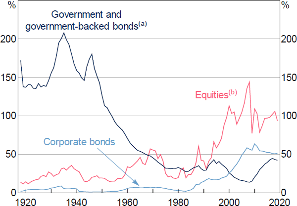
Around this time, companies on the Sydney Stock Exchange had an aggregate market capitalisation which fluctuated around 20 to 40 per cent of GDP, substantially smaller relative to the economy than its value today (Figure 1).[4] It expanded rapidly in the resources boom of the late 1960s, but a large part of this was due to increases in the market value of existing companies rather than new listings. These valuations often substantially outpaced actual earnings, and the expansion proved to be temporary.
Notes:
(a) Includes central and state government bonds, as well as those issued by government-owned corporations
(b) Includes only companies listed on the Sydney Stock Exchange prior to 1964, so may understate the size of the market for this period
Sources: ASX Limited ABN 98 008 624 691 (ASX); ABS; Author's calculations; Black et al (2012); Foster (1996)
The market again expanded rapidly from around the 1980s, continuing until about 2000, supported by the privatisations of the Commonwealth Bank and Telstra, financial institution demutualisation, and an increased supply of capital to the share market due to compulsory superannuation (Gizycki and Lowe 2000). Other share markets around the world also expanded similarly around the same time.[5] The Australian market had increased to around 100 per cent of GDP by around 2000, and has grown broadly in line with GDP since.
2.2 Equity Market Returns
As noted earlier, returns on investing in equity comprise two parts: capital gains and dividends. A reliable long-run share price index is already calculated by Lamberton, so this section focuses primarily on trends in dividend payments as the novel contribution of the paper. Nonetheless, it is worth noting some basic facts about developments in share prices over time, and how these have differed across different sectors of the market.
2.2.1 Share prices
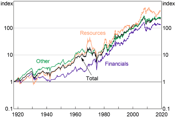
Share prices of the top 100 companies have increased by a geometric average of around 6 per cent per year over the past 100 years, or by around 2 per cent after accounting for inflation.[6] Over the long run the different industrial sectors have generally performed quite similarly, although there have been periods of over and underperformance (Figure 2). For instance, bank stocks underperformed for several decades following the Great Depression, while resources stocks outperformed in the run-up to the Poseidon bubble and then did quite poorly afterward (see Simon (2003) for further discussion of this period).
Notes: Solid lines show series calculated from RBA dataset, dashed lines show Datastream series; dates correspond to start of calendar year
Sources: ASX; Author's calculations; Refinitiv Datastream
2.2.2 Dividends
2.2.2.1 Corporate profits
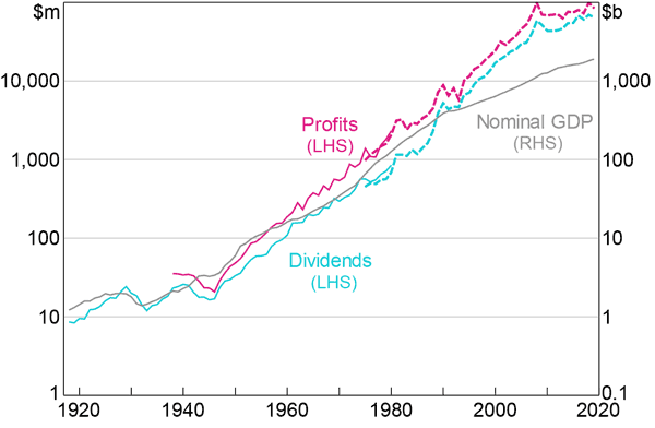
Dividends payments to shareholders are facilitated by corporate profits, and so to understand trends in dividends, it is important to understand trends in profits. Listed company profits have grown by an average of around 10 per cent per year since 1937 (Figure 3), generally tracking GDP growth for most of the period covered by the RBA dataset, although earnings have been more volatile. There are a few exceptions to the tight relationship. In the 1940s, earnings decreased substantially even as GDP increased, probably reflecting the effects of wartime mobilisation on the Australian economy. In the 1990s earnings substantially outstripped GDP. This occurred alongside the expansion of the stock exchange, which grew a lot faster than the economy as a whole (Figure 1). More recently, as the market has stabilised in relative size, earnings growth has been broadly in line with – or even a touch slower than – nominal GDP.
Notes: Solid lines show series calculated from RBA dataset, dashed lines show Datastream series for top 100 companies; spliced back with growth rates implied from Foster (1996) prior to 1987
Sources: ASX; Author's calculations; Foster (1996); Refinitiv Datastream
2.2.2.2 Dividend payout ratios
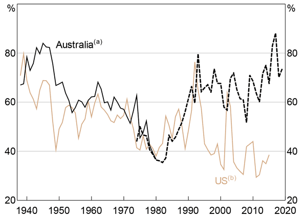
On average around 65 per cent of listed company earnings were paid back to investors in the form of dividends from 1917 until the present (this ratio is commonly referred to as the dividend payout ratio), although this has varied over time (Figure 4). Fluctuations in this number have been remarkably correlated with the equivalent figure for the United States, at least prior to the introduction of franking credits in the 1980s (where shareholders can claim back tax already paid by the corporation). Since changes in the payout ratio should, in principle, reflect changes in companies' expected return on investment, this correlation may reflect the broadly similar economic fortunes of the two countries over this period. The introduction of franking credits in the 1980s is widely believed to have boosted dividend payout ratios (Bergmann 2016); this is particularly clear from Figure 4.
Notes:
(a) Solid line shows series calculated from RBA dataset, dashed line shows implied ratio from Datastream data
(b) Excluding 2008
Sources: ASX; Author's calculations; http://www.econ.yale.edu/~shiller/data.htm; Refinitiv Datastream; Thomson Reuters
2.2.2.3 Dividend yields
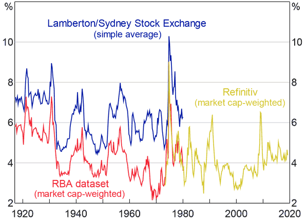
From the perspective of an investor, perhaps the more important figure is the dividend yield: the ratio of annual dividends to share price, meant to reflect the yield an investor would have earned for holding shares.[7] There is a pre-existing Australian dividend yield time series, which is widely used, calculated by Lamberton, continued by the Sydney Stock Exchange, and re-published in other sources. These data have widely acknowledged problems (Brailsford, Handley and Maheswaran 2008). Until at least 1980 they represent a simple average of company dividend yields for those available, rather than the modern practice of being weighted by market capitalisation (in part to better reflect returns on a realistic investment portfolio). Since larger companies tend to have lower dividend yields, the equally weighted Lamberton series is biased upward, and therefore gives an overestimate of the return on equities. It also excludes companies paying zero dividends.[8] Some careful attempts have been made to adjust for this problem by scaling down the Lamberton yield by a fixed amount (Brailsford et al 2008), but the RBA dataset allows us to calculate the yield directly. This shows that the dividend yield on a market capitalisation-weighted portfolio of stocks is about 200 basis points lower than Lamberton's estimates, although the correlation between the two series is high (Figure 5). The series calculated from the RBA dataset also closely matches the Refinitiv Datastream series where they overlap. Similar numbers are also calculated (for a relatively short period) in Foster (1996). This allows us confidence that the series calculated here is accurate.
Note: Dates correspond to start of calendar year
Sources: ASX; Author's calculations; Lamberton (1958a, 1958b); Refinitiv Datastream
While lower in the RBA dataset than in the Lamberton series, dividend yields were nonetheless still quite high through the early part of the 20th century, fluctuating around 6–7 per cent (as of 2019, the S&P/ASX 200 – which has one of the highest yields among global equity price indices – has a dividend yield of around 4½ per cent). Yields trended down through the 20th century as share price growth outpaced dividends, only briefly recovering back to 1920s levels as resources companies' share prices declined sharply in the late 1970s.
2.2.3 Total returns and the equity risk premium
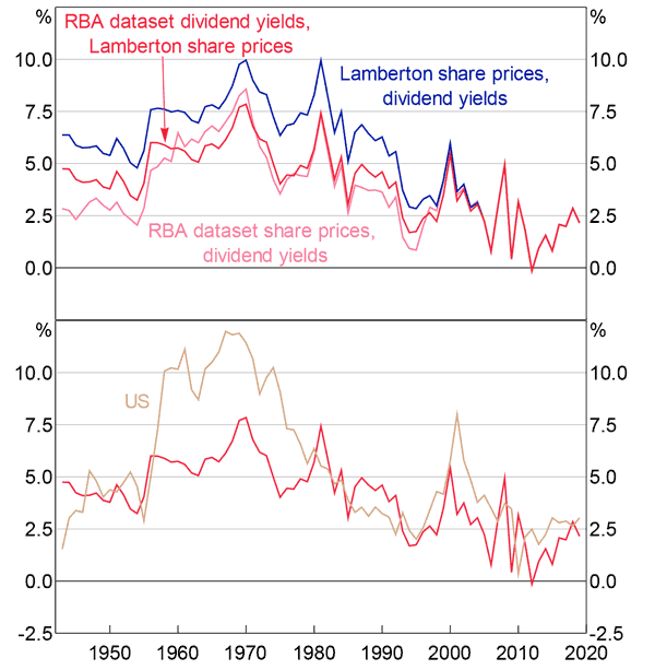
All else equal the lower dividend yield in the RBA dataset compared to other sources implies a lower total return to equity – and therefore a lower equity risk premium (ERP) (Figure 6).[9] If we add the dividend yields onto capital gains calculated in Lamberton's share price series, this results in an average realised return on equity of around 4 per cent in excess of that on safe assets (here 10-year government bonds).[10] This is roughly a percentage point lower than estimates from Brailsford et al (2008), which themselves are approximately adjusted for the Lamberton dividend yield issue and therefore on the lower end of Australian ERP estimates. The realised equity return relative to safe assets declined substantially in recent decades (and, relative to long-term bonds, briefly turned negative), as declines in interest rates granted bondholders large capital gains. Nonetheless, forward-looking measures of the ERP suggest the market currently expects an excess return of Australian equity of somewhere between 4–6 per cent (Bianchi et al 2015), which is broadly in line with the longer-run historical experience presented here. The new ERP estimates also bring the Australian ERP somewhat lower than the ERP in the United States for a large part of the 20th century; simply using the Lamberton data would result in a higher premium for Australia than for the United States. Interestingly the RBA dataset suggests a historical total return on equity very similar to that observed in the United States; the difference in the ERP (in an accounting sense) is due to the higher bond yields in Australia over the past century. The Lamberton data, in contrast, implies that returns on equities in Australia were much higher than that in the United States, partly offset (when considering the ERP) by higher bond yields in Australia.
Note: All series extended with Datastream data from 1979
Sources: ASX; Author's calculations; http://www.econ.yale.edu/~shiller/data.htm; Hunter (1958); Lamberton (1958a, 1958b); League of Nations yearbooks; RBA; Refinitiv Datastream
2.2.3.1 Total returns by sector
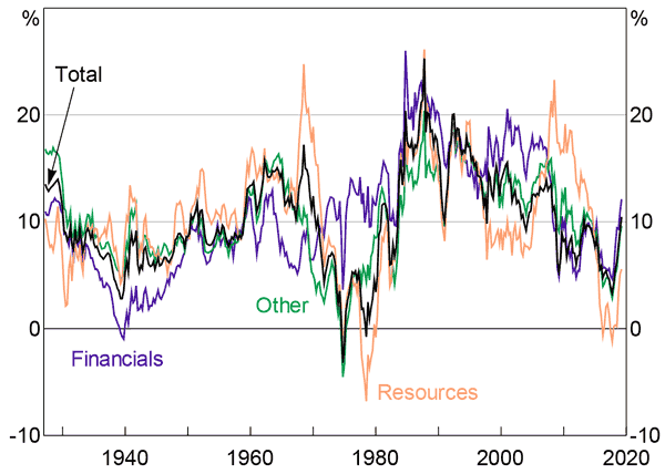
Total returns (i.e. the combination of capital gains and dividends) have been similar across sectors over time, with only a few exceptions (Figure 7). Financial stocks underperformed in the early-to-mid part of the 20th century, as the sector shrank due to the Great Depression and tighter financial regulation. On the other hand, their returns were more stable than the rest of the market through the 1970s, when other sectors performed poorly. Resources stocks outperformed for a time through the 2000s, supported by high commodities prices, but have since reversed much of that (relative) gain.
Notes: All series extended with Datastream data from 1979; dates correspond to start of calendar year
Sources: ASX; Author's calculations; Refinitiv Datastream
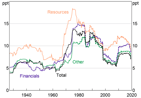
While returns have been similar across sectors, volatility in those returns has not. Resources stocks, in particular, have experienced materially higher volatility than other sectors of the economy (Table 2; Figure 8). This is not just attributable to the individual booms and busts, like the Poseidon bubble, but appears to have been a structural feature of the stocks for at least the past 100 years.[11] It does not appear to be the case that investors (or least a hypothetical investor buying in 1917 and holding for more than a hundred years) were compensated for this extra volatility.
| Geometric mean | Arithmetic mean | Standard deviation | |
|---|---|---|---|
| All shares(a) | 10.0 | 11.5 | 18.6 |
| Resources | 10.0 | 12.7 | 25.4 |
| Financials | 10.2 | 11.8 | 19.5 |
| Other | 10.2 | 11.6 | 18.1 |
| 10-year government bonds(b) | 6.3 | 6.5 | 7.7 |
| Consumer price inflation | 3.9 | 4.0 | 4.8 |
|
Note: (a) RBA dataset to 1979, Datastream index from 1980–2019 Sources: ABS; ASX; Author's calculations; Hunter (1958); Lamberton (1958a, 1958b); League of Nations yearbooks; Refinitiv Datastream |
|||
Notes: All series extended with Datastream data from 1979; dates correspond to start of calendar year
Sources: ASX; Author's calculations; Refinitiv Datastream
2.2.4 Other facts on returns
2.2.4.1 Volatility and correlations
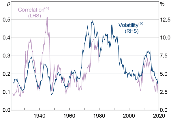
Volatility in Australian equity prices – in line with global asset markets – is currently considered to be very low relative to history (Reserve Bank of Australia 2018). But a longer perspective shows that volatility has probably been above-average since about the 1970s, and the current level (at least the relatively smoothed version calculated here) remains above historical troughs, particularly those observed in the first half of the 20th century (Figure 9). Volatility in the 1970s is of course largely attributable to the Poseidon bubble (Kearns and Pagan 1993). Share market volatility has also been closely related to share price correlations: when market volatility is low, shares of different stocks mostly move independently, but when volatility is high, stocks have tended to move together. Some had suggested that the increase in passive investment could result in an increase in correlation between individual stocks over time (Sushko and Turner 2018), but there appears to be little evidence for this in Australia.
Notes:
Dates correspond to start of calendar year
(a) Rolling pairwise correlations of quarterly price changes in top 100 companies (for which there are five years of consecutive data)
(b) Average absolute quarterly price change in the index
Sources: ASX; Author's calculations; Bloomberg; Lamberton (1958a, 1958b); Refinitiv Datastream
2.2.4.2 Average share prices
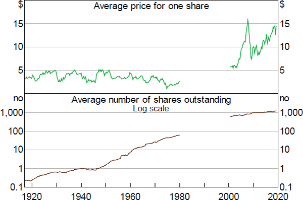
Between 1917 and 1979 the average nominal price of one share in the top 100 decreased slightly, even as consumer prices increased cumulatively by over 1,000 per cent over the same period (Figure 10). This reflected new share issuance by companies, particularly through stock splits, which kept per-share prices down even as their market capitalisation (and the broader share price index, which is adjusted for issuance) increased. Weld et al (2009) show a similar result for the United States, which they attribute to norms in the market for certain prices or per-share multiples that companies actively try to achieve by splitting their stock. In Australia, there is some suggestion in the early days of publicly traded companies that some firms may have deliberately priced individual shares expensively to dissuade speculators (Salsbury and Sweeney 1988, p 31), or other types of investors perceived to be undesirable. If that practice waned over time, we might have expected prices to trend down in real terms. However, more recent data show a substantial increase in the average price of a share since around 1990, suggesting that if norms or market practices were holding down share prices, it appears to be a historical phenomenon only.
Notes: 10 per cent trimmed mean; dates correspond to start of calendar year
Sources: ASX; Author's calculations; Bloomberg
2.3 Composition
2.3.1 By sector
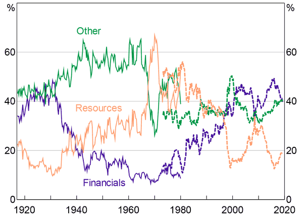
More than half of the modern stock exchange (by market capitalisation) is comprised of financials (particularly banks) and resources companies (particularly miners).[12] Strikingly, this was also the case 100 years ago, and in fact the relative proportions are very similar (Figure 11). Not only is the aggregate composition by sector the same as it was 100 years ago, but in many cases the exact same companies (albeit following some merger and acquisition activity) still dominate the exchange. Notwithstanding this, there have been some substantial movements in the relative size of the different sectors over this time.
Notes: Solid lines show series calculated from RBA dataset, dashed lines show Datastream series; dates correspond to start of calendar year
Sources: ASX; Author's calculations; Refinitiv Datastream
2.3.1.1 Resources
The resources sector has been a large part of the stock market since at least the early 20th century, reflecting its historical importance in the Australian economy. In 1917, it accounted for 24 per cent of the capitalisation of the top 100 stocks on the Sydney Stock Exchange, compared to around 20 per cent today. Steel (1939) claims that prior to World War I, trade in gold mining stocks accounted for four-fifths of activity on the Sydney Stock Exchange, although this is difficult to verify and they were worth quite a lot less than four-fifths of the total market capitalisation. Nonetheless, resources companies continued to grow relative to the rest of the Exchange from around the 1940s, and at their peak in 1969 accounted for around 65 per cent of the top 100 stocks by market capitalisation. While resources stocks picked up substantially relative to the rest of the market during the most recent mining boom in the 2000s, this growth was in fact smaller and more gradual than the sharp pick-up seen in the late 1960s and 1970s. In fact, in the 1960s–70s episode the rapid growth in resources companies on the Exchange saw its market capitalisation more than triple. Like the most recent episode, that boom occurred alongside a substantial increase in mining investment in the real economy (Battellino 2010), although it didn't lead to a similar increase in mining employment. In fact, the share of resources companies on the stock exchange has consistently outweighed their share of total employment, which has never been higher than 10 per cent (Connolly and Lewis 2010). Further resources sector price increases in the 1970s were supported by a substantial amount of speculative activity (the Poseidon bubble) and investor enthusiasm about the prospects of certain mines that in some cases turned out to be unfounded.
2.3.1.2 Financials
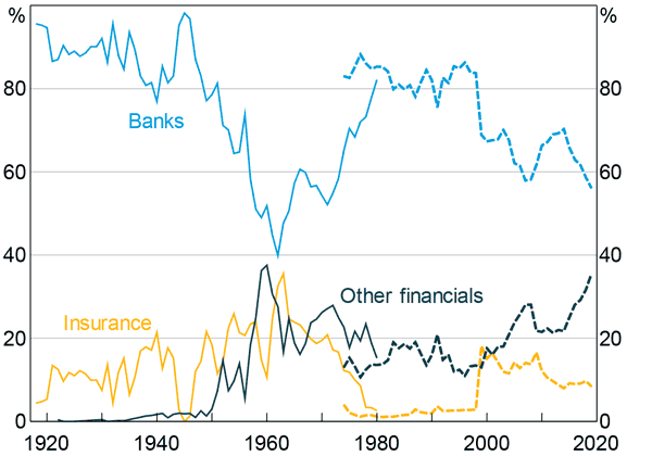
Over the 19th century, bank stocks played an important role in the early development of share trading in Australia (Adamson 1984; Salsbury and Sweeney 1988). By 1917, financials still made up more than 40 per cent of the top 100 companies by market capitalisation. However, their relative importance declined sharply during the Great Depression and World War II, and doesn't appear to have recovered – in relative terms – until around the 1980s. Most of the companies in the index survived through the 1930s and 1940s, even as they shrank relative to the rest of the market.[13] The subsequent increase in regulation of the sector – which included limits on profits, dividends and balance sheets (Maddock 2015) – may have been responsible for the decline in its relative size. The sector increased sharply in size from the 1980s as deregulation and increasing financialisation increased the size of banks relative to the rest of the economy (as well as the floating of the Commonwealth Bank), but the financial sector is still smaller on the exchange (in relative terms) than its peaks in the early 20th century.
Banks
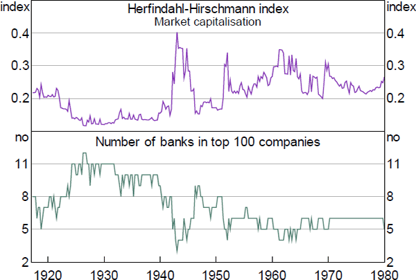
The modern listed banking sector is fairly concentrated, with the four major banks accounting for the majority of the market capitalisation of the sector. This has not always been the case (Figure 12). MacKay (1931, pp 2–3) notes that as of 1893 – the cusp of the banking crisis that year – there were 26 separate banks in Australia, although not all were particularly profitable or well capitalised. Around half of these were acquired by rivals during or after the panic of 1893. By 1917 there were thirteen banks trading in Australia, of which eight appeared in the top 100 companies on the Sydney Stock Exchange. But as the economy grew through the 1920s, new banks – often specialised in lending to specific types of customers – were founded to respond to the needs of the expanding economy. By the late 1920s the number of banks in the top 100 stocks had increased substantially. However, the stricter regulation after the Great Depression and World War II may have provided some impetus for consolidation. By the 1960s there were only six banks listed on the Sydney Stock Exchange. The expansion of the banking sector in the 1980s and 1990s was unlike previous expansions of the sector, in that it didn't appear to have resulted in new entrants to the sector; instead, the expansion was due largely to growth in the incumbents.
Note: Dates correspond to start of calendar year
Sources: ASX; Author's calculations
Non-bank financials
Over time, the listed financial sector has itself become more diversified (Figure 13). At the start of the 20th century, the sector was almost all banks, with insurance companies most of the (small) remainder. Insurance companies grew relative to the banks but remained fairly small until around the 1950s, when they started to expand more rapidly (helped perhaps by stricter banking regulation).
In the 1940s new types of listed financial corporations started to emerge, and made up an increasingly large part of the sector. The largest among these were initially ‘hire purchase’ companies, which made small short- and medium-term loans to consumers and businesses to purchase durable goods. These companies were controversial at first and met resistance from the stockbroking institutions (Adamson 1984), but nonetheless expanded rapidly. The profits of Australian Guarantee Corporation (the largest hire purchase company on the Sydney Stock Exchange) increased at an annual rate of 30 per cent between 1955 and 1975, and its market capitalisation expanded by a similar amount. By 1978 it was the 7th largest company on the Sydney Stock Exchange, with a market capitalisation just less than the Bank of New South Wales (one of the predecessors of Westpac), and larger than any of the other listed banks. As their business was taken over by banks and the sellers of the durable goods themselves, these companies declined in relative size; Australian Guarantee Corporation was taken over by Westpac in 1988. However, the listed non-bank sector continued to grow as the broader financial sector expanded and diversified through the 1980s and 1990s, particularly due to the growth in the size of both investment companies and diversified financial companies offering a broader range of financial products.
Note: Solid lines show series calculated from RBA dataset, dashed lines show implied series from Datastream series
Sources: ASX; Author's calculations; Refinitiv Datastream
2.3.1.3 Other
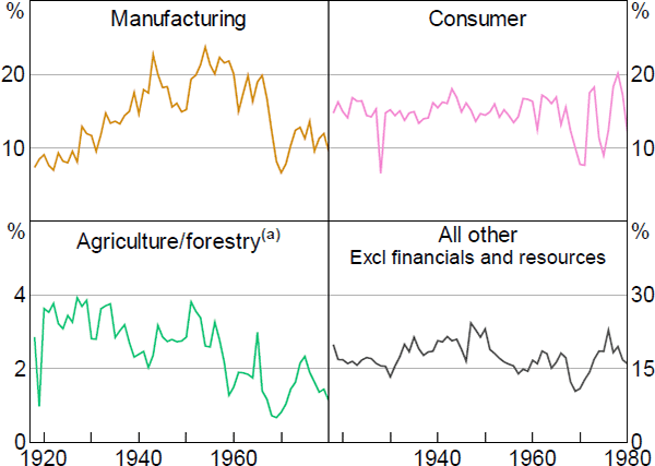
The ‘other’ sector (everything but resources and financials) reached its peak share of the index around 1960, and has declined since (Figure 11). This aligns fairly closely with the relative peak and decline of Australia's manufacturing sector (ABS 2005), and indeed, this appears to explain a large part of it (Figure 14). Tooth and Co. (a brewery) and British Tobacco traded the spots of second and third largest companies on the exchange (the largest being Broken Hill Proprietary) for around 20 years, ending in the 1950s. Until the 1960s large manufacturing conglomerates like Australian Consolidated Industries (glassware and plastics), ICI (chemicals) and Australasian Paper and Pulp were among the largest listed companies as well. But these companies subsequently declined in relative terms, and most have since delisted.
From 1917 until 1980 consumer stocks made up an average of around 15 per cent of the market. This share was subject to some volatility, but there was little overall trend over the decades. The sector was represented by a high number of listed department stores in the early part of the century, but newspaper companies featured prominently also. Listed agricultural and forestry companies, while never particularly large, have declined in relative terms since around the 1930s.
Notes:
Industry split is approximate, based in part on historical publications and contemporaneous news articles; dates correspond to start of calendar year
(a) Excluding National Dairy Products
Sources: ASX; Author's calculations
Transportation companies have also been prominent on the stock exchange since its inception, but over time railway and steamship companies have mostly been replaced by those focusing on roads and airports. Shipping, in particular, was still a very large industry on the stock exchange at the start of the 20th century, perhaps reflecting that a large number of the early joint stock companies were shipping ventures. Companies like the Union Steam Ship Company of New Zealand (the ‘Southern Octopus’) and Sydney Ferries were among the largest companies on the exchange at various times, and at its peak the Southern Octopus was the largest private sector employer in New Zealand (McLean 1993). Shipping – particularly of people – accounts for little of the exchange today, but other transport companies like Transurban, Qantas and Sydney Airport are nonetheless large.
2.3.2 Concentration
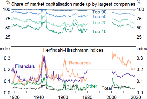
Like the modern ASX, the Sydney Stock Exchange was dominated by large, old companies. The largest 10 listed companies have accounted for around half the market capitalisation of the top 100 stocks on average from 1917 until 2018 (Figure 15). Concentration appears to have peaked during periods of high commodity prices such as the 1960s and 1970s, reflecting in part the sharp expansion of large resources companies.[14] The resources and financial sectors were, and continue to be, notably more concentrated than the rest of the market.
Note: Dates correspond to start of calendar year
Sources: ASX; Author's calculations; Bloomberg
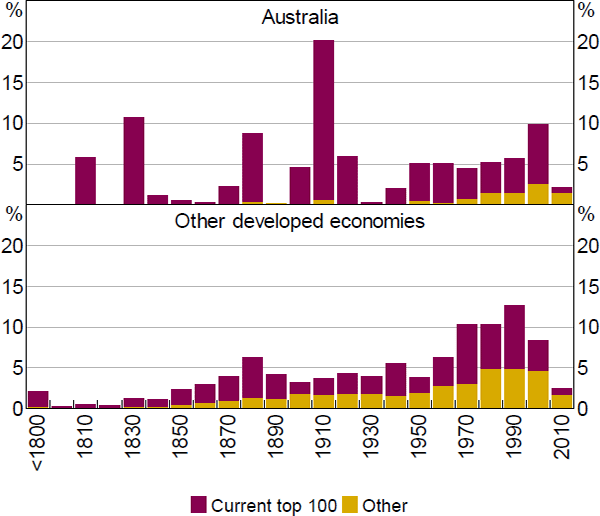
The identity of these top 10 companies has been persistent: of the top 10 companies in 1917, 6 were still in the top 10 at the end of 2017, and 2 more remained in the top 200 (Table 3; Figure 16). In contrast, only one of the top 10 US companies in 1917 is still in the top 10 today (Kauflin 2017). In fact, in comparison to other major equity markets, Australia's listed corporations are old: weighted by market capitalisation, the average listed company in Australia today is 105 years old, compared with 77 years in Japan, 82 in the United States and 95 in the United Kingdom.
| Company name | Market Capitalisation Rank | Notes | |||
|---|---|---|---|---|---|
| 1917 | 2019(a) | 1917 Sydney Stock Exchange |
2019 ASX(a) |
||
| Bank of New South Wales | Westpac | 1 | 3 | Merged with Commercial Bank of Australia in 1982 to form Westpac |
|
| British Tobacco | British American Tobacco | 2 | na | Delisted from ASX in 2001 following acquisition; British American Tobacco currently listed in the United Kingdom | |
| Bank of Australasia | ANZ | 3 | 5 | Merged with Union of Australia Bank in 1951 to become ANZ | |
| Union of Australia Bank | ANZ | 4 | 5 | See above | |
| Colonial Sugar Refining Co. | CSR | 5 | 139 | Sold its sugar refining operations in 2010, now produces building products |
|
| Commercial Bank of Sydney | NAB | 6 | 6 | Merged with National Bank of Australasia to become NAB in 1982 |
|
| Broken Hill Proprietary |
BHP Group | 7 | 2 | ||
| Union Steam Ship Company of New Zealand | na | 8 | na | Acquired by P&O and later closed | |
| Howard Smith | Wesfarmers | 9 | 8 | Acquired by Wesfarmers in 2001 |
|
| Mount Lyell Mining Co. |
Iluka Resources | 10 | 89 | Several rounds of acquisition and mergers in the interim | |
|
Note: (a) As at June 2019; if the company has been acquired or merged, this is the name/rank of the acquirer or new entity; see ‘Notes’ Sources: ASX; Author's calculations; Bloomberg; delisted.com.au; National Library of Australia |
|||||
Sources: Author's calculations; S&P Capital IQ[15]
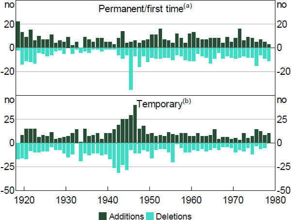
There has still been some churn in the market, at least of the smaller companies. Between 1917 and 1979, around 7 new companies entered the top 100 for the first time each year on average (Figure 17). In fact, permanent additions/deletions were much more common than temporary churn at the bottom of the index, particularly if we abstract from the temporary deletions during World War II, when liquidity dried up.
Notes:
Top 100 companies by market capitalisation as at December
(a) Companies entering the index for the first time, or exiting and not returning before the end of the sample
(b) Companies exiting that return before the end of the sample, or re-entering the index
Sources: ASX; Author's calculations
2.4 Valuations
Market participants and observers calculate equity price valuations for a range of reasons. For participants, knowing when a company's share price is high or low relative to some metric (for example, compared with its realised profits) might be taken as a sign to buy or sell it. For regulators and policymakers, high valuations are often taken as signs of exuberance in the market. Of course, they may reflect other things, such as the relative return on safe assets. This section outlines some common valuation metrics that can be calculated using the RBA dataset since the early part of the 20th century, and discusses trends. Different metrics tell different stories: price-to-earnings ratios are in line with their history, but price-to-net-tangible assets ratios are quite high.
2.4.1 Price-to-earnings ratios
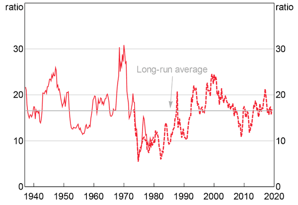
Trailing price-to-earnings (PE) ratios are the ratio of the current share price to the company's earnings per share over the previous twelve months.[16] PE ratios were a bit more volatile in the past than we see today. However, the current ratio for the top 100 stocks is within 10 basis points of its average since 1937 (Figure 18). This is in contrast to the experience of some other countries, where PE ratios are high (see, for example, Graph 1.6 in Reserve Bank of Australia (2017)), although for the United States at least this may reflect the relative growth of the listed tech sector, which has tended to have an above-average PE ratio.
Notes: Solid lines show series calculated from RBA dataset, dashed lines show Datastream series; long-run averages calculated using RBA dataset until 1979, Datastream series thereafter
Sources: ASX; Author's calculations; Refinitiv Datastream
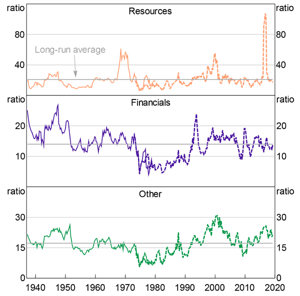
There are three historical peaks in PE ratios: in the late 1940s following the end of World War II, in the late 1960s and early 70s during the mining boom and Poseidon bubble, and then – to a lesser extent – around the turn of the century, coinciding with the so-called dot-com bubble overseas. Valuations increased very quickly in the run-up to the 1987 ‘Black Monday’ share price crash, but even at their peak were not substantially above long-run averages. The post-war peak in PE ratios was driven by the non-resources sectors of the market, while the peak in valuations in the early 1970s was almost entirely due to the resources sector (Figure 19). The trough in valuations in the 1970s and 1980s follows the OPEC oil crises, high inflation and several property company failures, and PE ratios remained low (outside the resources sector) until the late 1980s.
PE ratios for each sector are also similar in 2018 to their long-run averages. Of note, the recent mining boom saw trailing PE ratios in the resources sector peak higher (and fall more sharply) than they did during the Poseidon bubble, which was characterised by a substantial investor enthusiasm that in hindsight turned out to be misplaced. However, the recent episode involved a substantial ramp-up in investment as mining companies put in place capital to enable future production; during this period profits were low but it was clear they would grow rapidly in the future (and forward-looking PE ratios do not show quite the same sharp peak).
Notes: Solid lines show series calculated from RBA dataset, dashed lines show Datastream series; long-run averages calculated using RBA dataset until 1979, Datastream series thereafter
Sources: ASX; Author's calculations; Refinitiv Datastream
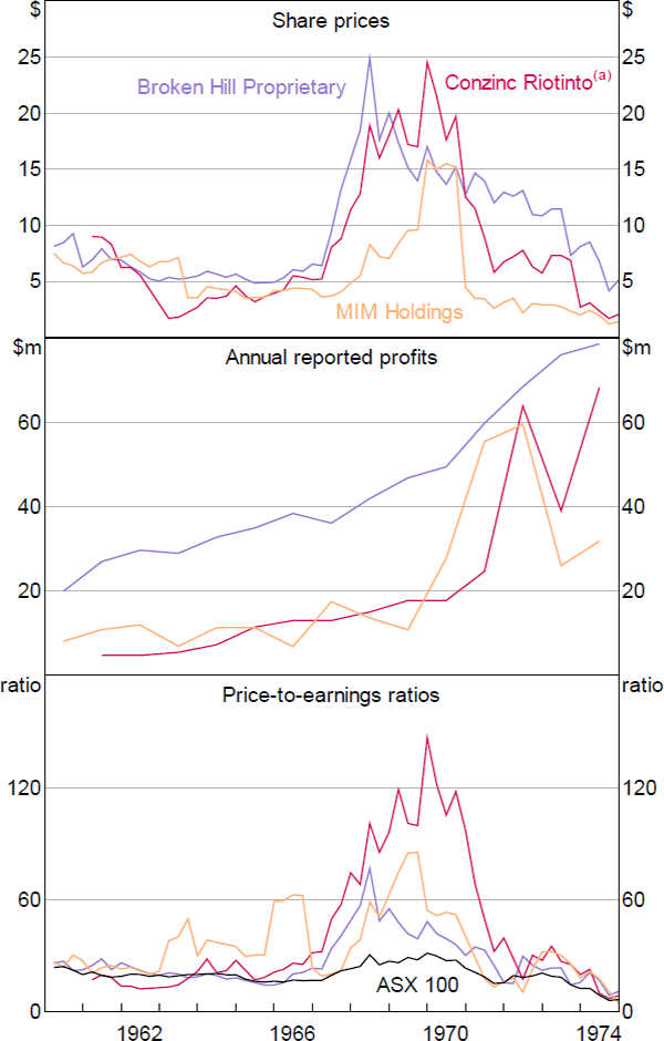
The RBA dataset also sheds some light on just how stretched valuations became during the Poseidon bubble. Simon (2003) notes that the success of Poseidon shares drove a range of legally dubious share issuance by small players. But it is worth noting that the bout of investor enthusiasm wasn't just limited to Poseidon and small-capitalisation stocks; it also appears to have dragged up valuations at large established companies as well (Figure 20), although some commodity prices did increase at this time as well. Even Broken Hill Proprietary, which was already the largest company on the exchange, saw its share price increase by around 5 times, far in excess of its eventual realised earnings growth. On the other hand, after the bubble had subsided in 1974 its share price was back to where it had been 10 years previously, even as earnings had more than tripled in the interim. Valuations at (relatively) smaller companies like Conzinc Riotinto were even more extreme.[17]
Notes:
All values converted to dollars from pounds at 2:1 where appropriate
(a) Consolidated Zinc prior to 1970
Sources: ASX; Author's calculations
2.4.2 Price-to-book ratios
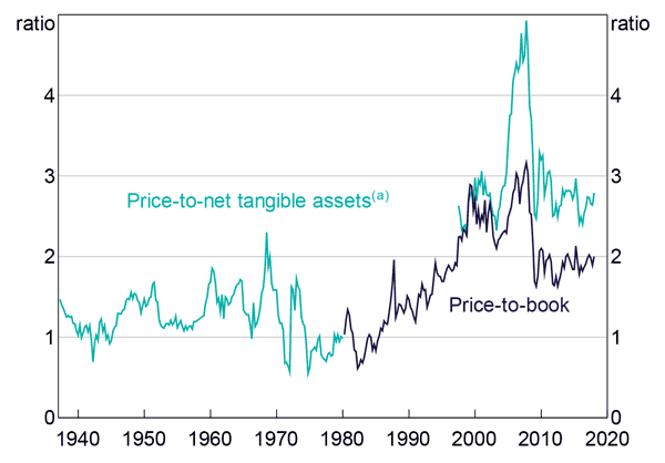
The price-to-book ratio is an alternative valuation metric, reflecting the premium the market is willing to pay for a company's assets over their accounting cost. Historically, it was common to exclude intangible assets when reporting balance sheets; this is also the case in company accounting information published in the Sydney Stock Exchange Limited Gazettes. Therefore the ratios calculated here are more accurately referred to as price-to-net tangible assets.
In contrast with the price-to-earnings measure, the price-to-net tangible asset ratio shows a substantial increase since 1980, which occurs in between the end of the RBA dataset and the start of the earliest available current time series (Figure 21). This isn't entirely implausible, since the price-to-book ratio increased by a similar amount in that period. But this is in contrast with the price-to-earnings ratio, which suggested no substantial change in valuations over this period.
Notes:
Dates correspond to start of calendar year
(a) RBA dataset to 1979, S&P/ASX 200 from 1999–2018; no data available in the interim
Sources: ASX; Author's calculations; Refinitiv
3. Conclusion
The Australian equity market has grown over the past century to be one of Australia's most important financial markets. Use of a hand-compiled unit record dataset has allowed us to derive and present several important historical facts about the market. Perhaps most important are the lower historical returns on equity, which have implications for estimates of the equity risk premium in Australia. But the data presented on dividend payouts, industry composition and share valuation also help provide a richer history of the market than was previously available, and it is hoped that all these facts are of use to researchers and practitioners.
Appendix A: Data Coverage and External Validity
A.1 Data Coverage
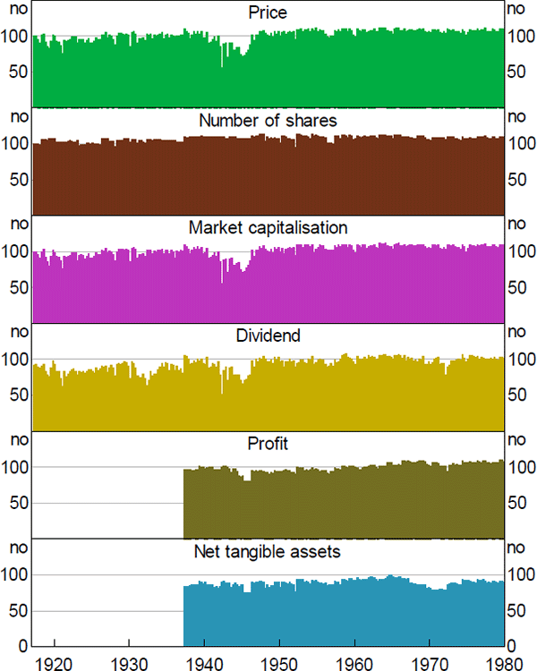
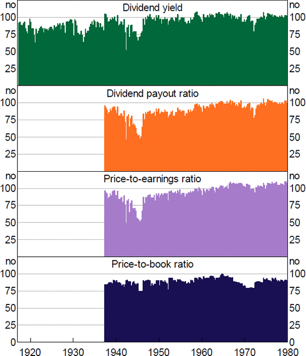
Although the quarterly data cover the top 100 in principle, in practice not every variable exists for every date for every company. In particular, there was a drop-off in trading activity during World War II, which meant there were fewer companies with available share prices and therefore market capitalisation data. In addition, the ratios tend to have worse coverage than the individual variables, because companies need to have coverage for both variables to be included (e.g. for a price-to-earnings ratio, every company in the sample needs to have a market capitalisation and a profit number, to make sure the numerator and the denominator are measuring the same set of companies (Figures A1 and A2).
Note: Dates correspond to start of calendar year
Note: Dates correspond to start of calendar year
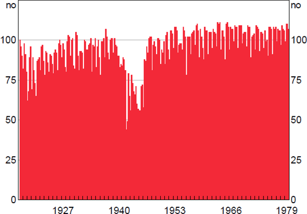
The list members were re-determined each year, but back histories for newly added companies weren't entered. This matters for calculating growth rates for use in the price index, which is impossible in the March quarter for newly added companies since we don't have their December quarter share prices. Therefore, the number of companies in the March quarter values of the equity index is lower than the number in the other quarters (Figure A3).
Note: Includes only companies with consecutive price and share data
A.2 Data Issues
The dividends data required substantial harmonisation to create a consistent time series, and some errors may have been introduced as part of this process. Initially, it was common to report them as per cent of the paid-up capital of the company. Later on, yields were reported, but not for mining companies, where the value of dividends was reported instead. Prior to decimal currency, yields appear to have been reported in per cent, but displayed in pounds (e.g. 4.5% would be written as £4 10s, since there were 20 shillings to a pound). Later still, dividends were reported in dollar terms per share (the modern practice). However, later in the RBA dataset interim dividends became more popular, complicating the calculations. Each of these can be converted into the modern concept of a dividend yield (annual dividend per share divided by share price), but errors may have been introduced, particularly where the source data were ambiguously labelled or misinterpreted.
The RBA dataset only cover shares listed on the Sydney Stock Exchange. Companies were able to dual list, and it appears most large companies did list in Sydney. Data for the Melbourne Stock Exchange were compared for two arbitrary years and it was found that including them would only increase total coverage by about 5 per cent.
Missing values are not always distinguishable from zeroes in the source data. Probably the only variable of interest likely to be exactly zero would be a dividend. But it appears that the number of missing dividend values is relatively small in any case.
A.3 Share Price Index
The share price indices calculated are probably the least reliable of all the series due to the lack of information required to calculate an accurate divisor, a number used to deflate the index due to adjustments in the capital structure of included companies. To calculate this requires information about the terms of equity issuance, which is lacking from the RBA dataset: we can only infer issuance from a change in the number of shares outstanding.
The approximation used is to assume that all equity issuance greater than 100 per cent of shares outstanding is a stock split, and not dilutive of existing shareholders. Everything else is assumed 100 per cent dilutive and therefore the index is revised down. As a result of this, the Lamberton share indices should be preferred to the ones calculated from the RBA dataset, where they are available. Lamberton did not calculate an aggregate index prior to 1936; in line with common practice, in this paper I have spliced it back with his commercial and industrial index. So the index calculated from the RBA dataset is more comprehensive prior to 1936, which a user may wish to weigh against the weaknesses noted here.
The growth rate of the index is calculated as
where pi,t is the share price of company i at time t; q is the quantity of shares outstanding, and is the divisor, and n is the number of companies in the sample at that time. In other words, the formula is the growth rate in the market capitalisation of the index, adjusted for equity issuance that dilutes shareholders. Only companies with the necessary values in both periods are included in the calculation.
The divisor, , is calculated as the adjusted net equity issuance for a given company:
where equals qi,t except where , in which case, . The effect of this to reduce the growth in market capitalisation of a company by its net share issuance, except when that share issuance looks like a stock split (i.e. when the number of shares outstanding more than doubles in one quarter). In this case, we assume investors are not diluted.
The divisor is not used in the other series presented in this paper, since they are primarily ratios and it would therefore cancel out. As such, those series are likely more reliable (other than the caveats already presented in this section).
A.4 External Validity
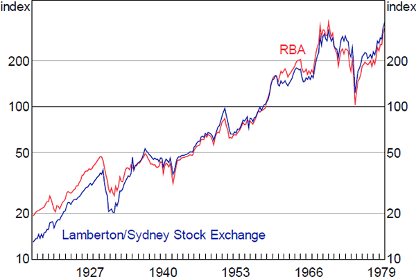
Notwithstanding the issues noted above, and the fact that they are calculated from different lists of companies, the implied share price index from the RBA dataset and the index calculated by Lamberton align quite closely, particularly from the mid 1930s on (Figure A4), which is when Lamberton's coverage became more comprehensive.
Sources: ASX; Author's calculations; Lamberton (1958a, 1958b)
References
ABS (Australian Bureau of Statistics) (2005), ‘100 Years of Change in Australian Industry’, Year Book Australia, 2005, No 87, ABS Cat No 1301.0, Australian Bureau of Statistics, Canberra, pp 427–435.
Adamson G (1984), A Century of Change: The First Hundred Years of the Stock Exchange of Melbourne, Currey O'Neil Ross Pty Ltd, Melbourne.
Battellino R (2010), ‘Mining Booms and the Australian Economy’, Address given to The Sydney Institute, Sydney, 23 February.
Bergmann M (2016), ‘The Rise in Dividend Payments’, RBA Bulletin, March, pp 47–56.
Bianchi RJ, ME Drew and AN Walk (2015), ‘The (Un)Predictable Equity Risk Premium’, Challenger Limited, November. Available at <https://papers.ssrn.com/sol3/papers.cfm?abstract_id=2694373>.
Black S, J Kirkwood, A Rai and T Williams (2012), ‘A History of Australian Corporate Bonds’, RBA Research Discussion Paper No 2012-09.
Brailsford T, JC Handley and K Maheswaran (2008), ‘Re-Examination of the Historical Equity Risk Premium in Australia’, Accounting & Finance, 48(1), pp 73–97.
Connolly E and C Lewis (2010), ‘Structural Change in the Australian Economy’, RBA Bulletin, September, pp 1–9.
Fisher C and C Kent (1999), ‘Two Depressions, One Banking Collapse’, RBA Research Discussion Paper No 1999-06.
Foster RA (1996), Australian Economic Statistics: 1949-50 to 1994-95, Occasional Paper No 8, rev 1997, Reserve Bank of Australia, Sydney.
Gizycki M and P Lowe (2000), ‘The Australian Financial System in the 1990s’, in D Gruen and S Shrestha (eds), The Australian Economy in the 1990s, Proceedings of a Conference, Reserve Bank of Australia, Sydney, pp 180–215.
Hunter JSH (1958), ‘Interest Rates in Australia, 1931-1956: Post-Mortem on an Era of Cheap Money’, Masters Thesis, The Australian National University.
Kauflin J (2017), ‘America's Top 50 Companies 1917-2017’, Forbes, 28 September, viewed 3 May 2019. Available at <https://www.forbes.com/sites/jeffkauflin/2017/09/19/americas-top-50-companies-1917-2017/>.
Kearns P and AR Pagan (1993), ‘Australian Stock Market Volatility: 1875-1987’, The Economic Record, 69(2), pp 163–178.
Lamberton DMcL (1958a), Security Prices and Yields 1875–1955, Pamphlet, Sydney Stock Exchange Research and Statistical Bureau, Sydney.
Lamberton DMcL (1958b), Share Price Indices In Australia: An Examination of the Measurement and Significance of Changes in Share Prices Together with New Indices for the Period July 1936 – December 1957, Law Book Co. of Australasia Pty, Sydney.
MacKay ALG (1931), The Australian Banking and Credit System, P.S. King & Son, Westminster.
Maddock R (2015), ‘Capital Markets’, in S Ville and G Withers (eds), The Cambridge Economic History of Australia, Cambridge University Press, Port Melbourne, pp 267–286.
McLean G (1993), ‘Mills, James’, Dictionary of New Zealand Biography, Te Ara – The Encyclopedia of New Zealand, viewed 3 May 2019. Available at <https://teara.govt.nz/en/biographies/2m48/mills-james>.
Mehra R and EC Prescott (1985), ‘The Equity Premium: A Puzzle’, Journal of Monetary Economics, 15(2), pp 145–161.
Merrett DT and S Ville (2016), ‘Big Business in Twentieth-Century Australia’, Centre for Economic History The Australian National University, Source Papers in Economic History No 21.
Reserve Bank of Australia (2017), ‘The Global Financial Environment’, Financial Stability Review, April, pp 3–12.
Reserve Bank of Australia (2018), ‘Box A: The Period of Low Volatility in Financial Markets’, Statement on Monetary Policy, February, pp 25–26.
Salsbury S and K Sweeney (1988), The Bull, the Bear and the Kangaroo: The History of the Sydney Stock Exchange, Allen & Unwin, Sydney.
Shiller RJ (2000), Irrational Exuberance, Princeton University Press, Princeton.
Simon J (2003), ‘Three Australian Asset-Price Bubbles’, in A Richards and T Robinson (eds), Asset Prices and Monetary Policy, Proceedings of a Conference, Reserve Bank of Australia, Sydney, pp 8–41.
Steel FO (1939), Short Sketch of the Early History of the Sydney Stock Exchange: And Some Particulars about the Working Systems of the London and New York Stock Exchanges, Pamphlet, sn, Sydney.
Sushko V and G Turner (2018), ‘The Implications of Passive Investing for Securities Markets’, BIS Quarterly Review, March, pp 113–131.
Taylor B (2018), ‘The Growth of the American Stock Market’, GFD Blog, Post #143, 22 May, viewed 3 May 2019. Available at <https://www.globalfinancialdata.com/GFD/Blog/the-growth-of-american-stock-market>.
Weld WC, R Michaely, RH Thaler and S Benartzi (2009), ‘The Nominal Share Price Puzzle’, Journal of Economic Perspectives, 23(2), pp 121–142.
Acknowledgements
I would like to thank Leon Berkelmans, Peter Tulip, Marion Kohler, John Simon, John Handley and seminar participants at the Reserve Bank of Australia and at the Australian Conference of Economists for their helpful comments and suggestions. I would also like to thank all those involved in the data collection process, including Susan Black, Jenny Hancock, Mitch Kosev, Anna Nitschke, Jon Kijurina, Mina Roberts, Dale Rodriguez, Anngalee Toth, Lisa Zhou, Hero Chheath, Robin Shen, Praveen Samarasinha and Xavier Foster-Pullman. I would also like to thank the staff of the AS Holmes Library, particularly Rosie Wisbey and Stephen Cupper, for their invaluable assistance. Any errors that remain are my own responsibility, and the views expressed in this paper are those of the author and do not necessarily reflect the views of the Reserve Bank of Australia.
Footnotes
Prior to 1987, individual stock exchanges existed in many different cities in Australia. In 1987 these merged to form the Australian Stock Exchange (now the Australian Securities Exchange, or the ASX). [1]
Further details on this can be found in Appendix A. [2]
See Adamson (1984) and Salsbury and Sweeney (1988) for discussion of this period and the transition to exchanges in Melbourne and Sydney. [3]
Since the data only cover the Sydney Stock Exchange they probably understate the value of the market a bit, as many companies, particularly smaller ones, would have listed only on other cities' exchanges. However, for those companies that were listed in Sydney, the Exchange provided data on their total shares outstanding, not just those listed in Sydney, meaning their total size can be correctly calculated. Perhaps due in part to this, estimates by Foster (1996) for the capitalisation of the entire exchange for the period from 1964 onward concur quite closely with the aggregates calculated from the Sydney Stock Exchange alone. [4]
The World Bank data do not extend much before the 1980s (available at <https://data.worldbank.org/indicator/CM.MKT.LCAP.GD.ZS?view=chart>), but data collected in Taylor (2018) suggest that the market capitalisation of the US stock market followed a similar trajectory over the 20th century. [5]
As noted in Section 1, for discussion of aggregate share prices I prefer the Lamberton (1958a, 1958b) calculated series and extensions of them where possible, since it probably adjusts better for share issuance than would an index calculated just from the RBA dataset which has limited information on issuance. The coverage of companies in the Lamberton index is quite similar to that in the dataset I use here. The exception is for comparison across sectors: here I use the RBA dataset to ensure that the changes in the sub-sectors add to the changes in the total index. [6]
The series discussed here are trailing yields; that is, calculated from the sum of dividends paid over the past twelve months. One weakness of this measure is when dividends are paid annually (as they were for much of the 20th century), the dividend data can become quite dated (in this case since the data are quarterly, up to nine months old), while the share price data should reflect the latest news. An important example of how this matters in Australia is in the resources sector: large, persistent increases in commodity prices can lead to quite predictable increases in dividends which will be capitalised into share prices, but not immediately into trailing dividends; this results in sharp, temporary declines in dividend yields. For example, this probably explains the fall in yields in the 1960s and then subsequent sharp recovery. One way to ‘look through’ this sort of phenomenon is to use forward yields, which are based on surveys of market analysts' expectations for future dividend payments, which should in principle be updated for new information at a similar pace to share prices. These surveys are not available historically, however. [7]
This is difficult to adjust for in the RBA dataset, as missing values are not always distinguishable from zeroes. However, even if every company missing dividend data was assumed to pay a zero dividend, the average yield over the 1917–79 sample would only be 20 basis points lower, suggesting that the effect of this was not large. This probably reflects the fact that it was rare for large companies to not pay dividends for any material period of time. The data shown here and subsequently do not include companies paying zero dividends for these reasons. [8]
I use the phrase equity risk premium here in common convention, although noting that it is controversial whether it can be totally explained by the extra risk associated with holding equities (Mehra and Prescott 1985). [9]
There are different ways to calculate the ERP which will yield somewhat different estimates of the level of the premium, but these will not affect the difference between using the RBA dataset and the Lamberton data. See Bianchi, Drew and Walk (2015) for an overview of the methodologies. [10]
In fact this volatility in resources companies' stock appears to have been present during the late 1800s as well: Lamberton (1958a) calculated a mining index from 1875 to 1910 which is exceptionally volatile relative to the other parts of the exchange for that period, and Salsbury and Sweeney (1988) note large booms and busts through the earlier parts of the 1800s. [11]
Here the RBA dataset shows some material differences with the Refinitiv Datastream series where they overlap through the 1970s, particularly in the relative size of the resources sector. This may reflect that the Sydney Stock Exchange had fewer resources companies than other exchanges in the country, since smaller resources companies might have been more likely to list closer to their operations, for example, in Melbourne or Brisbane. [12]
As detailed in Fisher and Kent (1999), few Australian banks failed during the Great Depression. [13]
There is a higher peak in World War II, but this largely reflects a lack of data as trading dried up for smaller stocks. [14]
This figure makes use of company founding dates from S&P Capital IQ; these data are Copyright © 2019, S&P Global Market Intelligence (and its affiliates, as applicable). [15]
For the index, this is the total market capitalisation of the index divided by the sum of company earnings. [16]
Meaningful PE ratios can't be calculated for Poseidon itself since it mostly made losses, and in any case was not in the top 100 companies by market capitalisation (and therefore not in the RBA dataset) for the initial part of the period in question. [17]